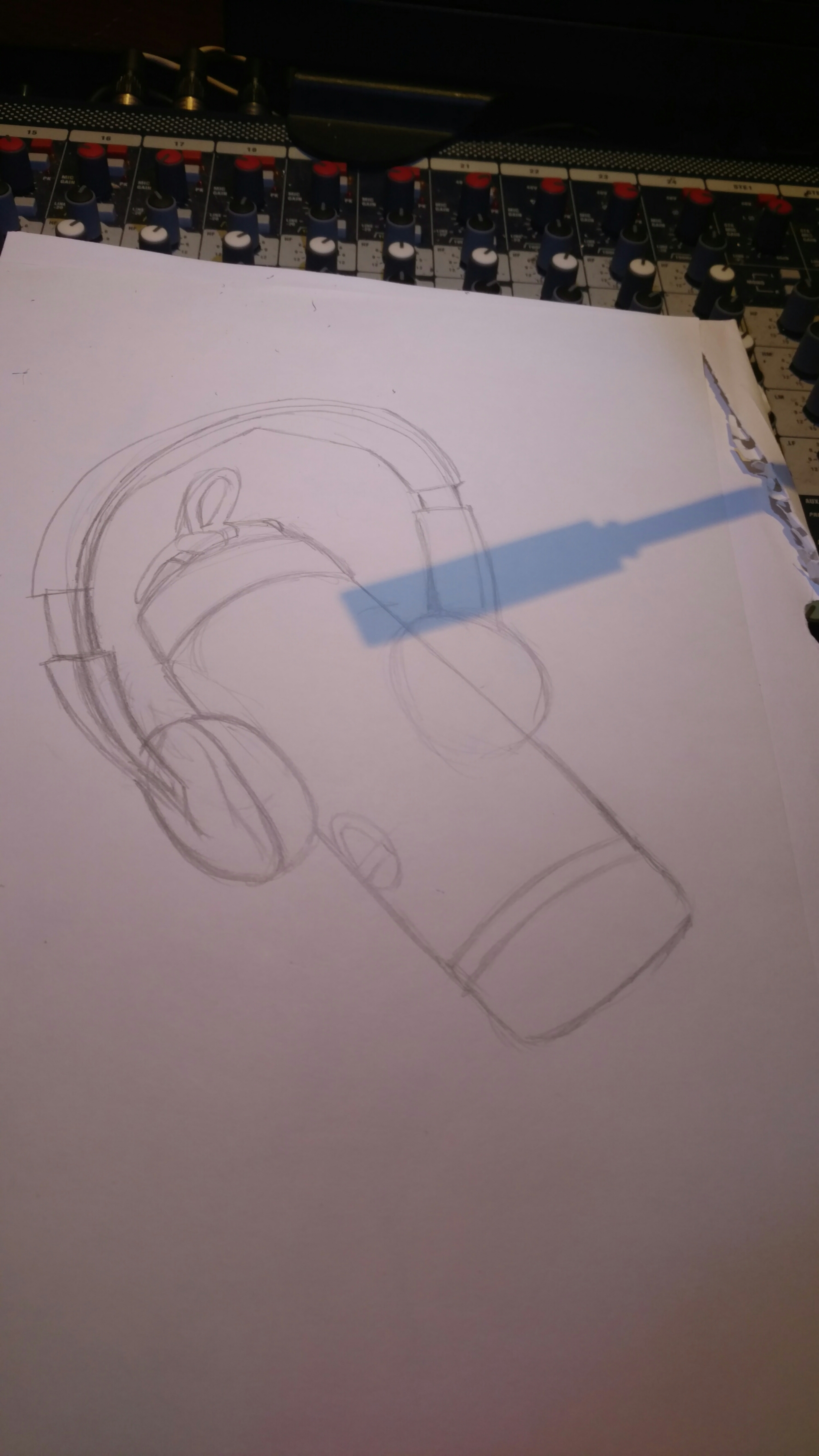
Sometimes I can slip in a picture at work and this is one of those times. Think of it as an art study, the kind teachers usually put on a person the middle of the room.
The drawing itself wasn’t the hard part. I knew the translucent quality of the bottle was what would try to kick my ass, so I begin by gameplaninng it first.
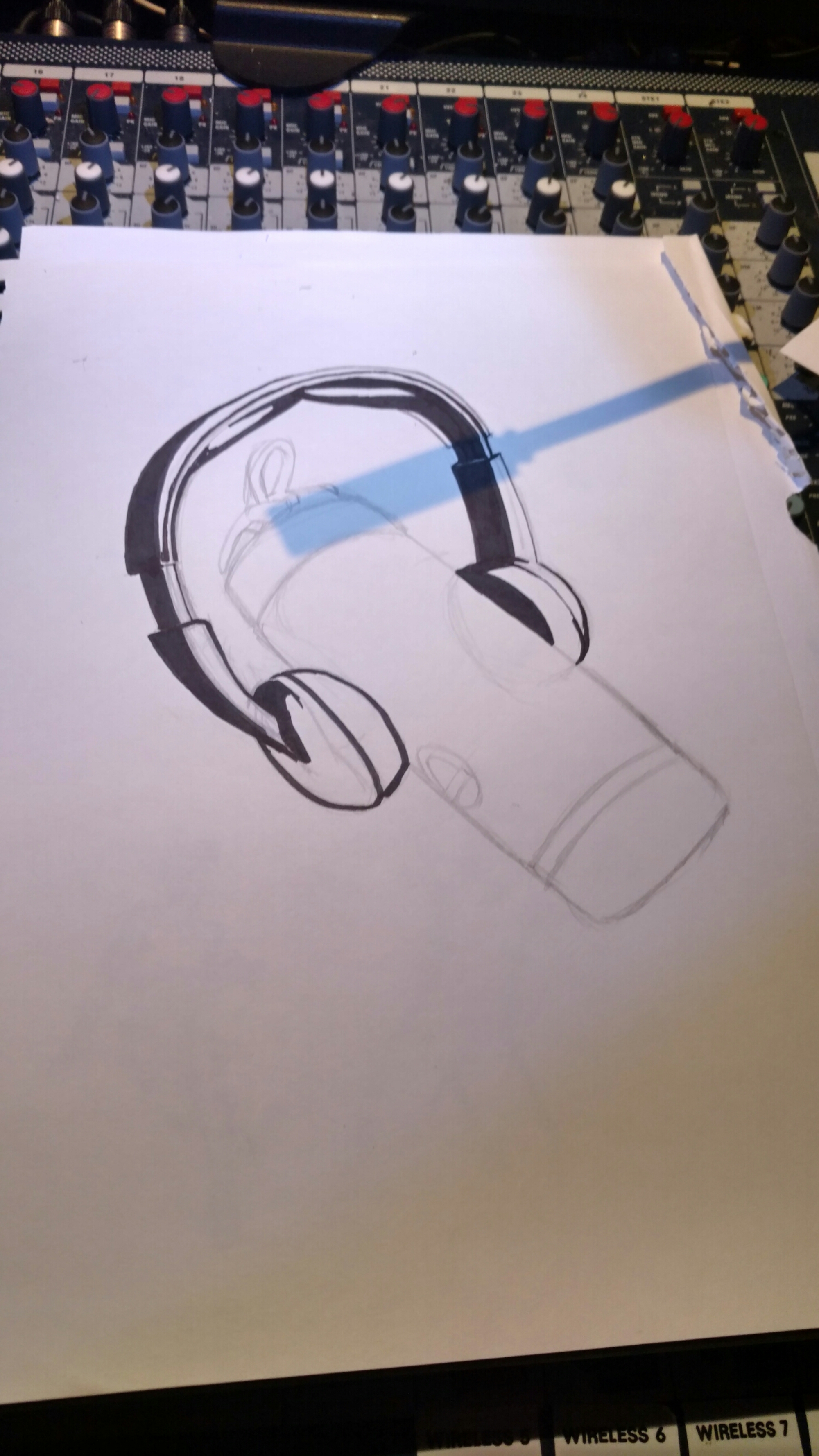
Of course I couldn’t ignore the headphones! Getting the textures right proved to be technically easy. Harder edges with more separation in values gave things that hard plastic sheen.

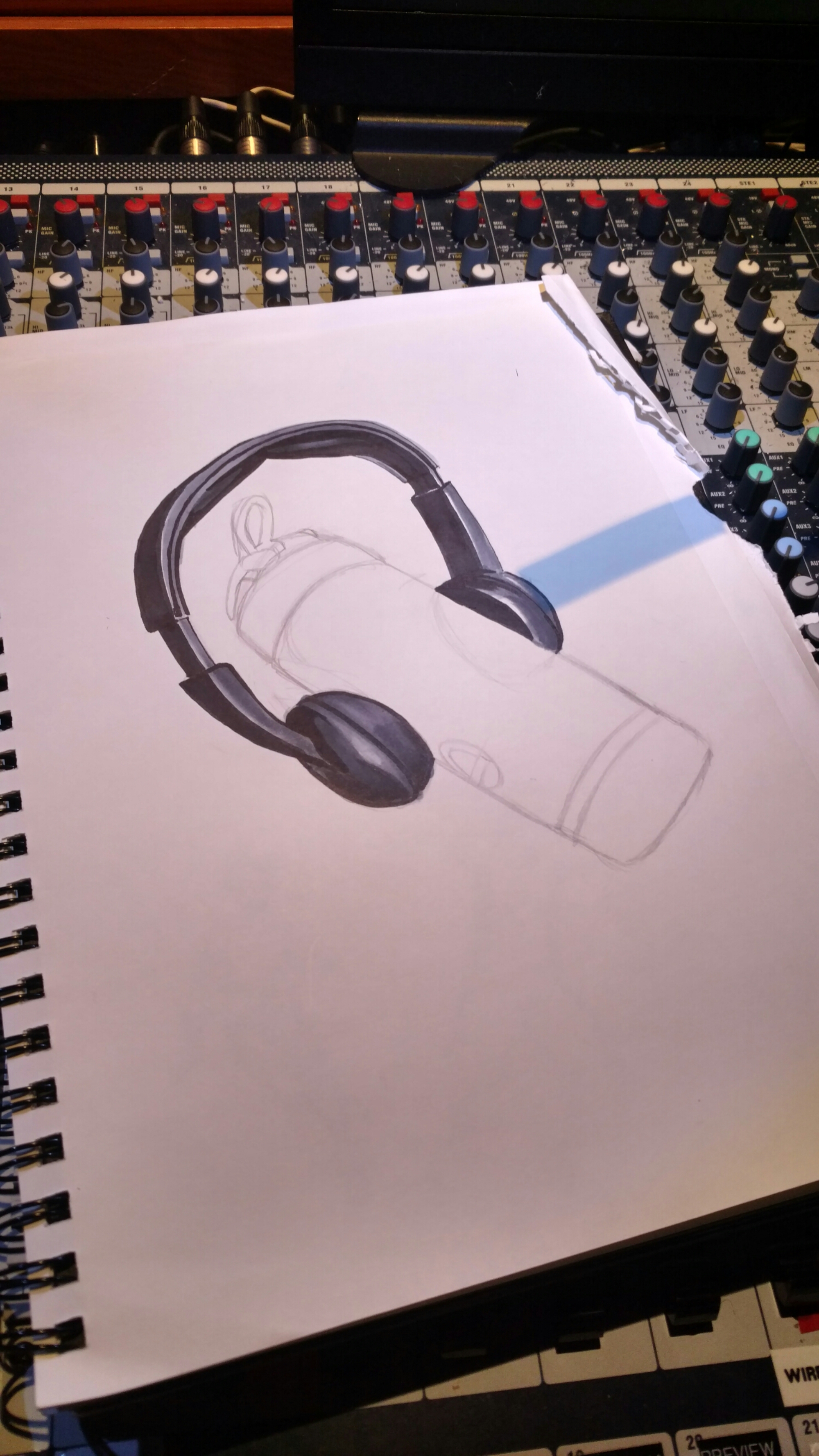
Now came the bottle itself. I began by laying out my mids and leaving highs as page white for now…
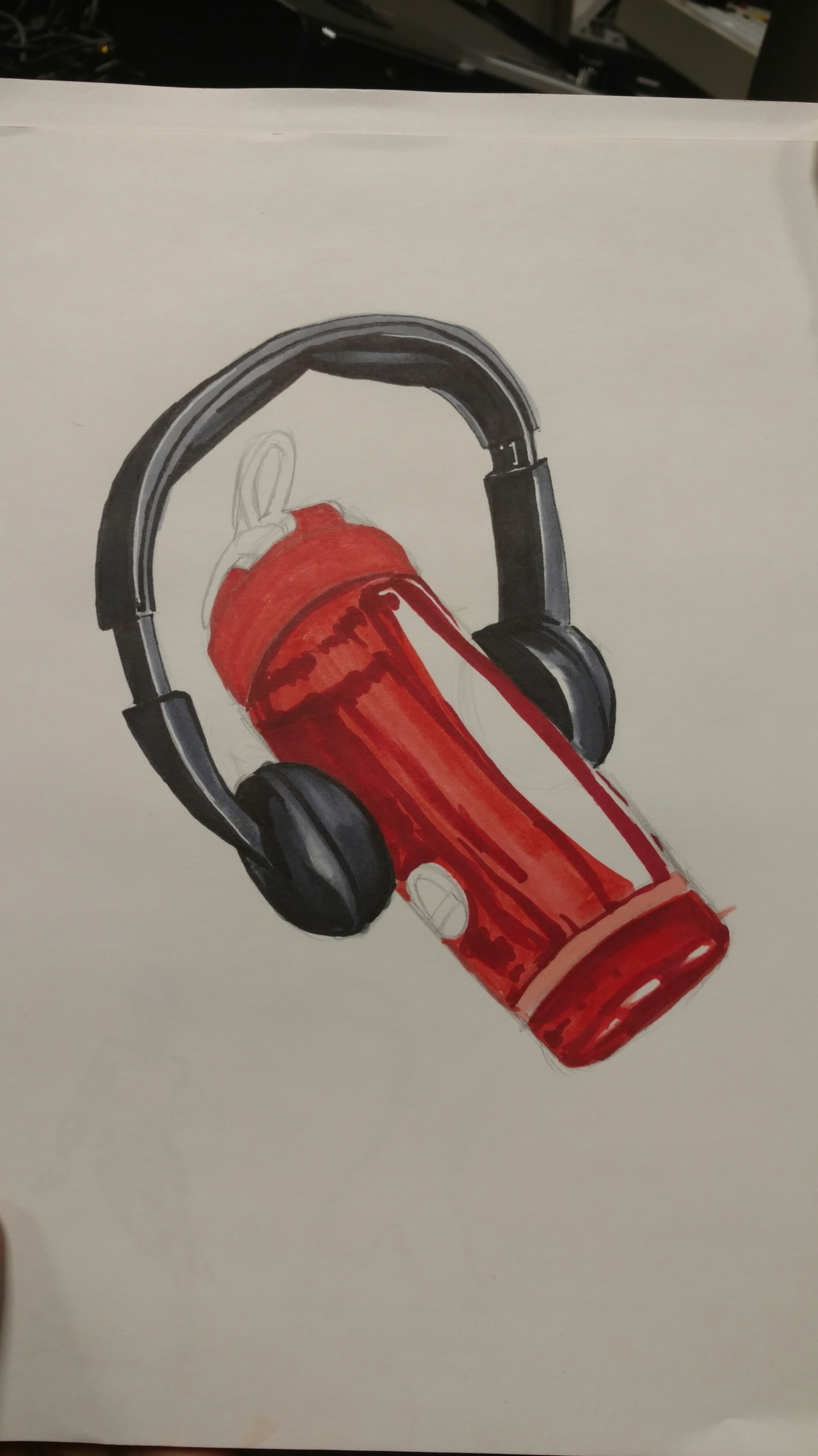
…after which I begin to add reflections by using a darker red. It gave the illusion of a highly reflective surface, which made for a good starting point.

From there I chose the original color I used to create my mids to add gradation to the bottle. It helped create the outline of the other speaker, as well as the twist grooves for the cap.

Finally I used Deco Peach to go over the entire thing and add a bit of glossiness to the bottle. A white gel pen created the lettering and logo and it was done!
I hope you guys like the end result.😊
