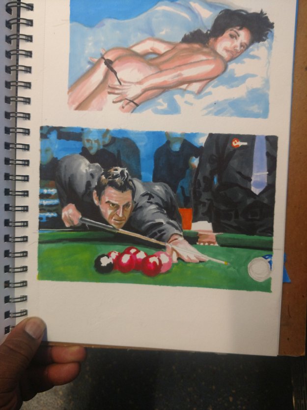
You can always tell from the start when an image is going to work out. The drawing flows out of you, the pallet is complimentary and you aren’t in a dark place emotionally.
My life feels like some semblance of order is starting to take shape. It’s nice; chaos is stress and while you can grow under pressure, it can also wear you down.
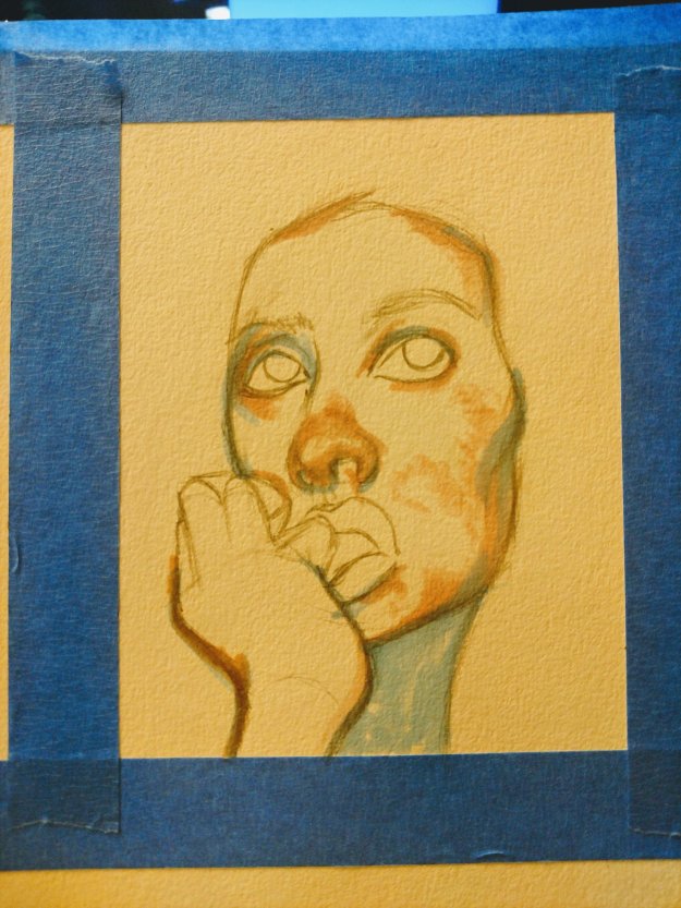
So this project was a result of a peaceful place that I haven’t been in for over a year.
That sounds worse looking at the words. Crap.

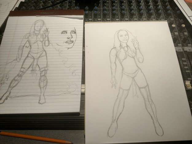
So anyway… I changed certain aspects of my blending and colored in my cool spots to take away the warmth in those areas.

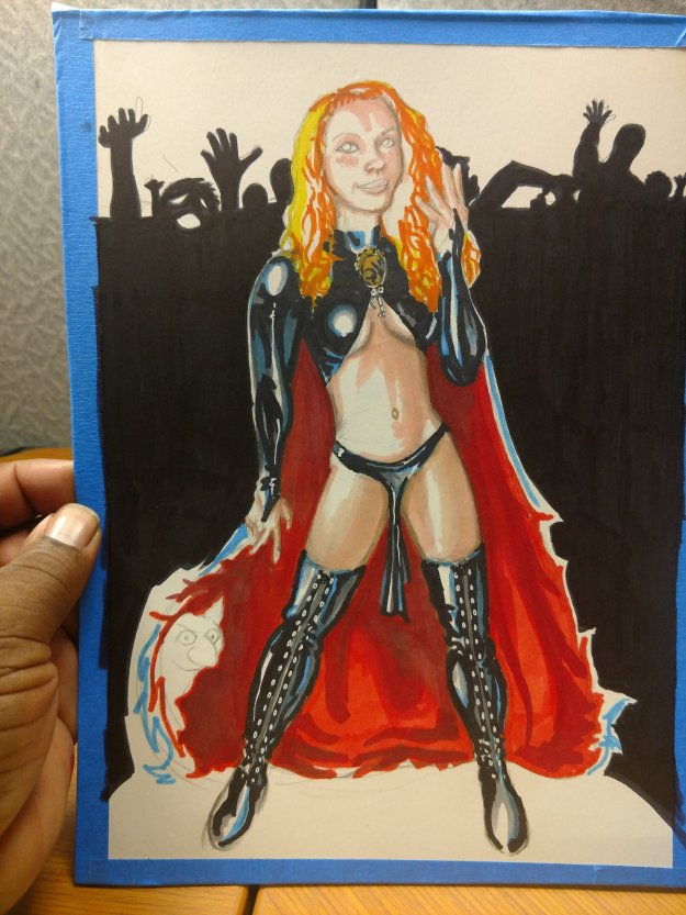
In the past I would colour match for the markers, but as they dried on the mixed media paper I would lose a lot of contrast. I solved this by going a step darker than I usually would.

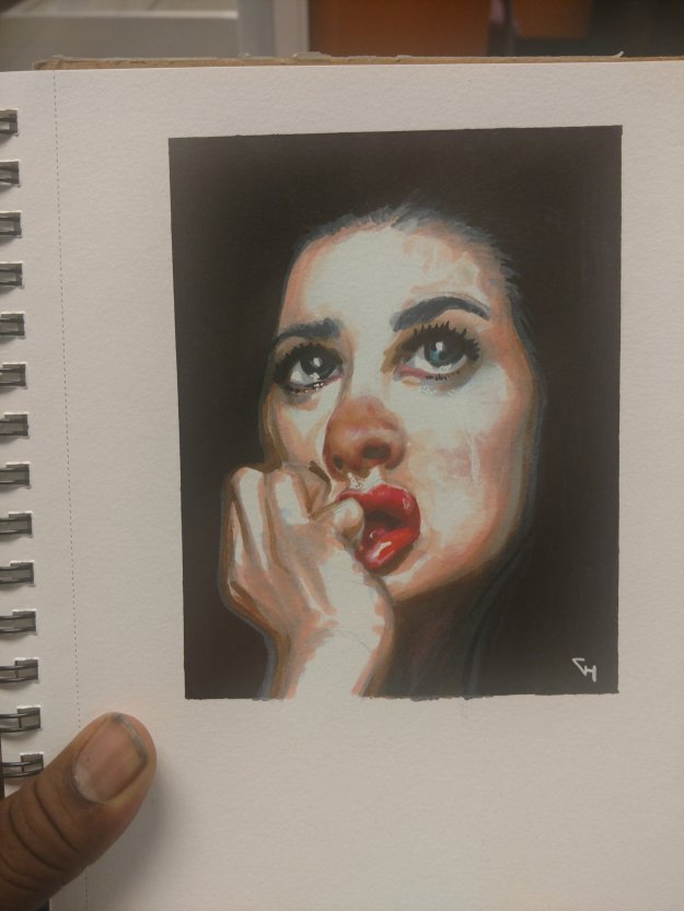
For me, eyes are pretty easy, but you can definitely overthink them. I see people who try to add every colour they see, without asking themselves should they. Let’s be honest; if the image isn’t big enough for that level of detail, why add it?
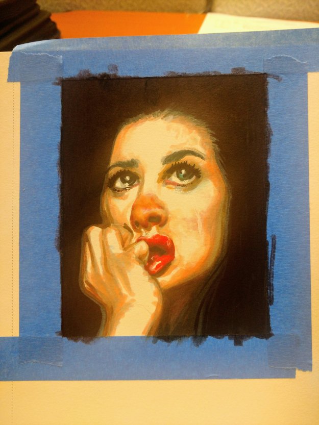
I learned something new. In the past my blacks never felt deep enough. I would go over them but not get to where I wanted them. But thanks to #inktober, I found a technique for that!
I also have perfect tape lines! So happy!
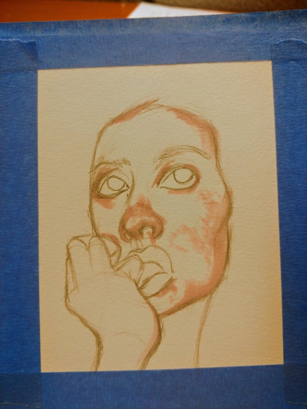
My goal with this was to make her “pretty ugly”; that is take a beautiful person and show them in an unflattering light. She’s crying and her nose is red and slightly runny. I hope you guys like it!