Tag Archives: tutorial

Illicit Response

     Okay…. I’m not sure about the age of my audience. I drew this pretty quickly, so hopefully no one gets upset. Ready? Here we go…

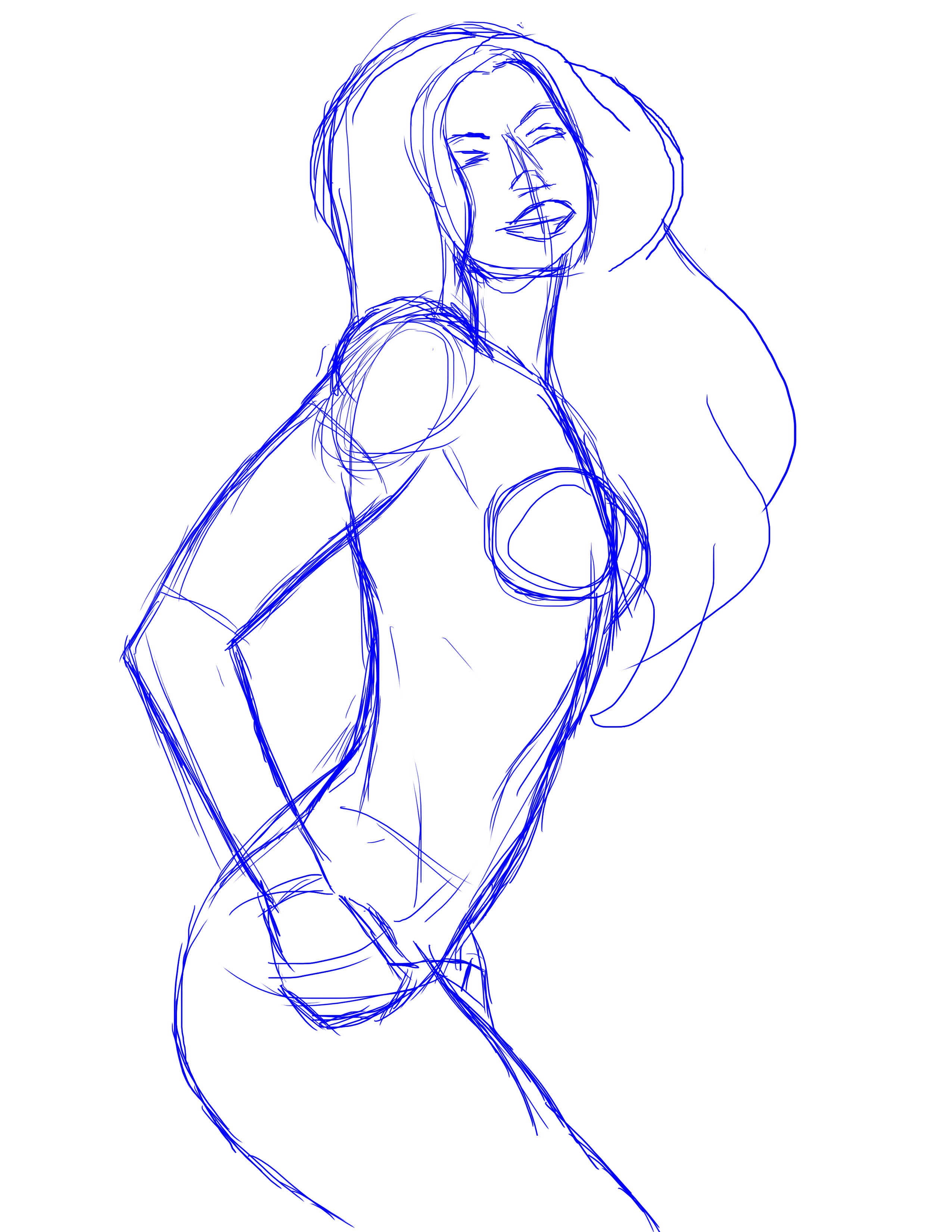
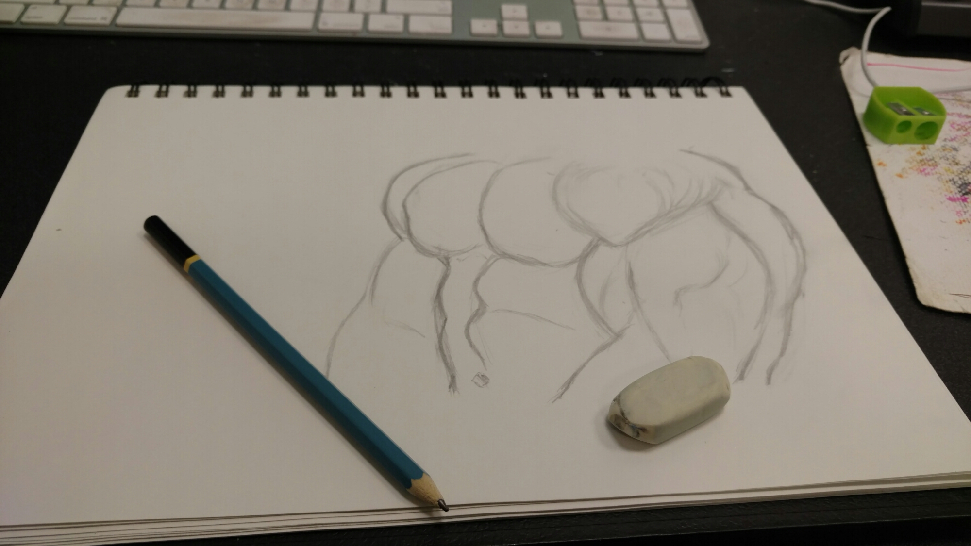
    So as much as finished pieces gets all the glory, it’s the ground work that makes it all come together.

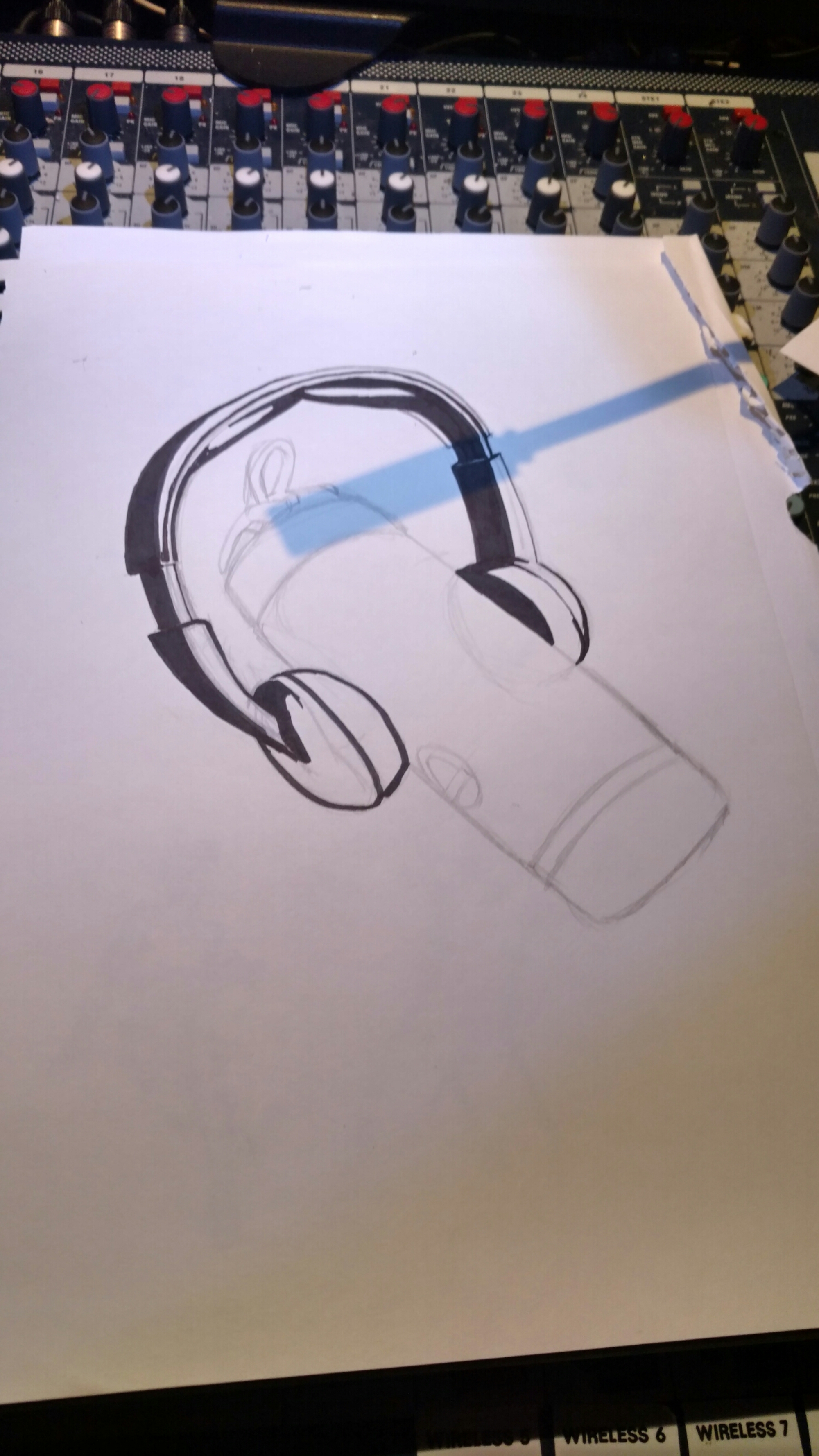
      I honestly was never one for sketching in the past. If I had an idea, I would just dive right in, no plan, just improvising as needed.

     But as I got further along in my career, I learned that having a plan isn’t necessarily a bad thing! It actually helps to know in advance what you’re doing. It helps in a lot of ways.
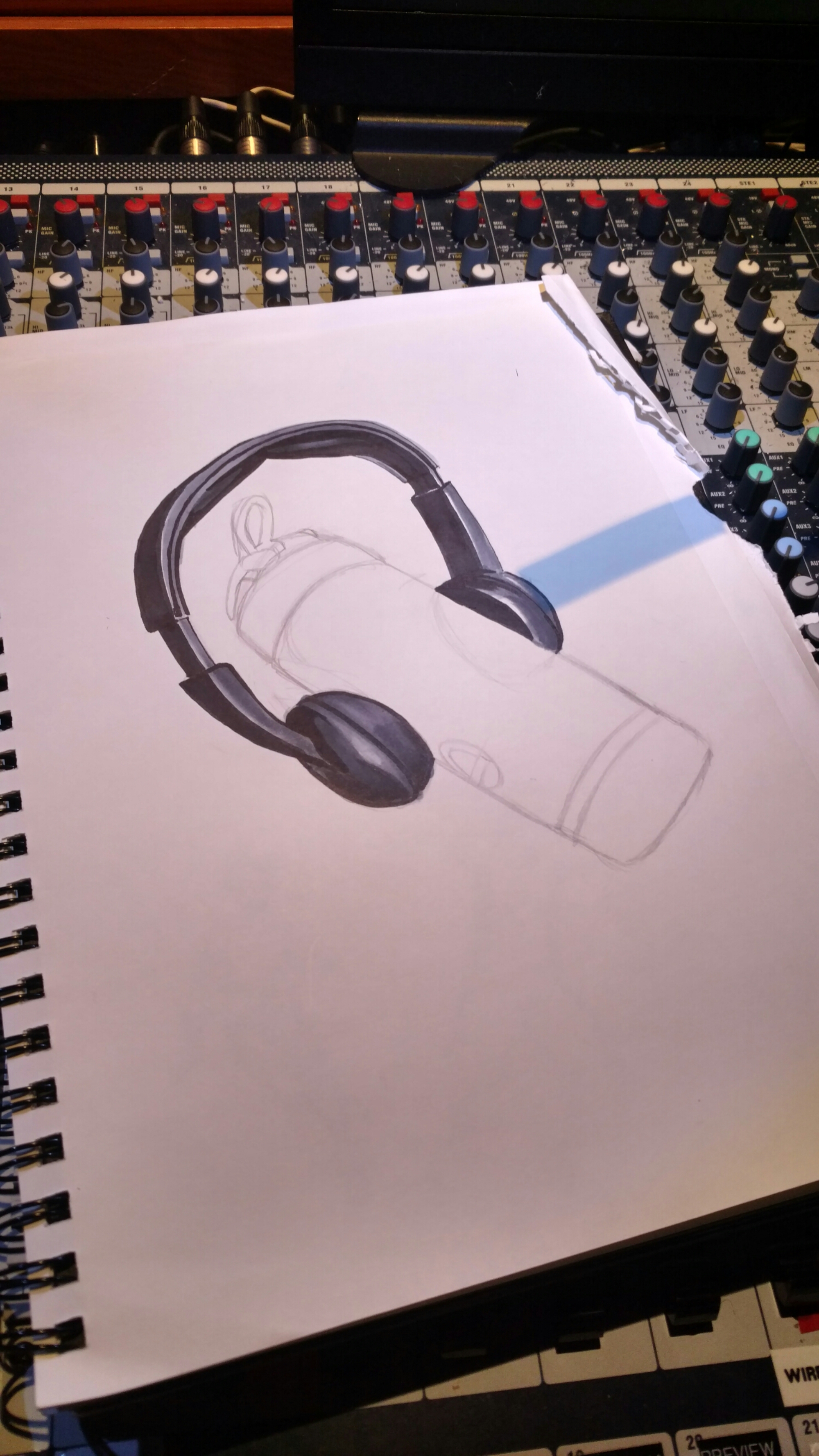
    For instance, I already knew ​where my light source would come from. It made layering my skin tones a LOT simpler.

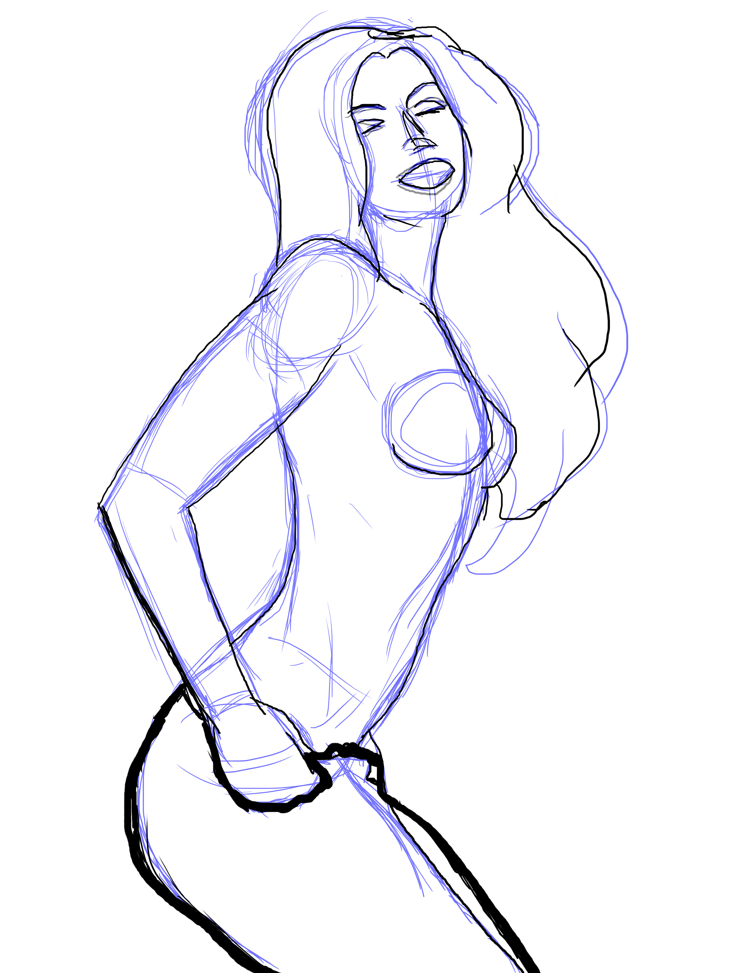
    Having a good layout helps with the speed I’m able to use here. I can reverse the image to make sure I have the balance needed.

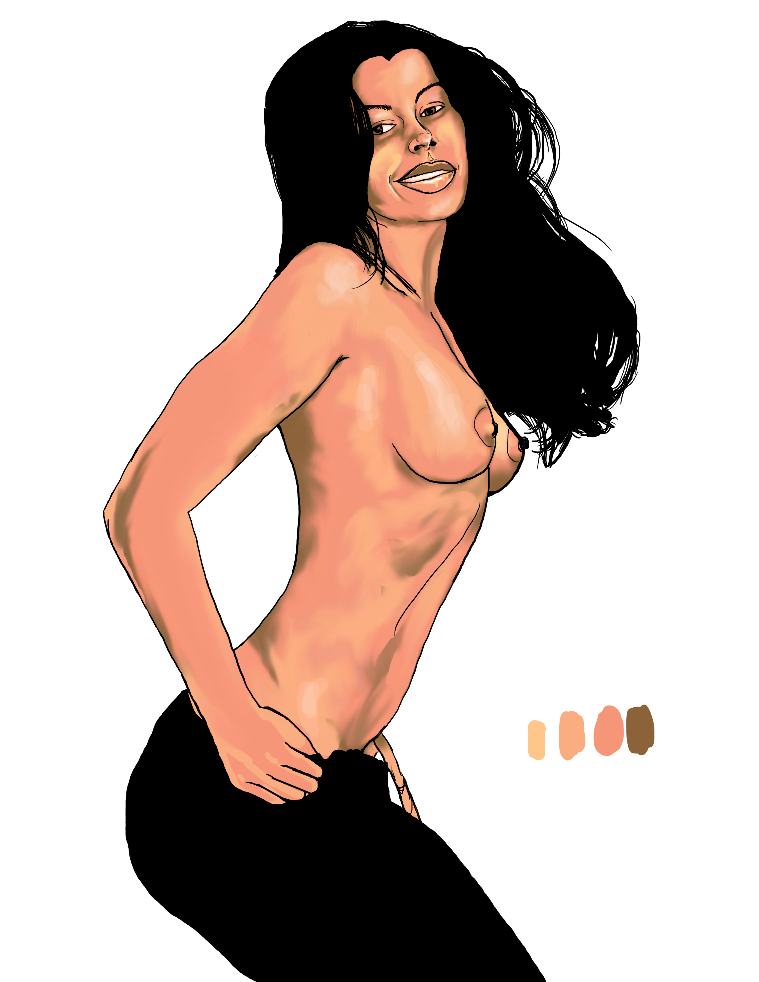
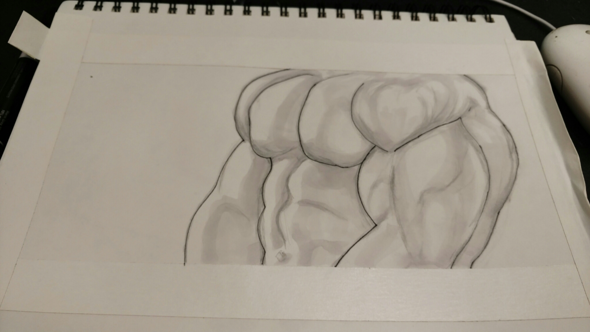
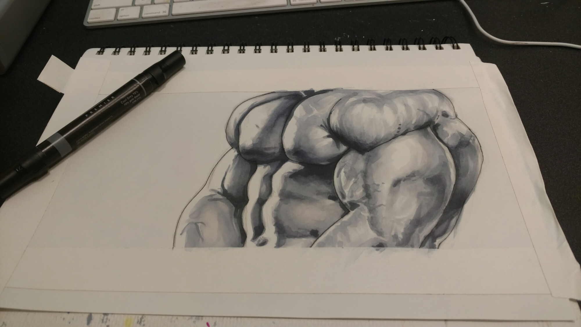
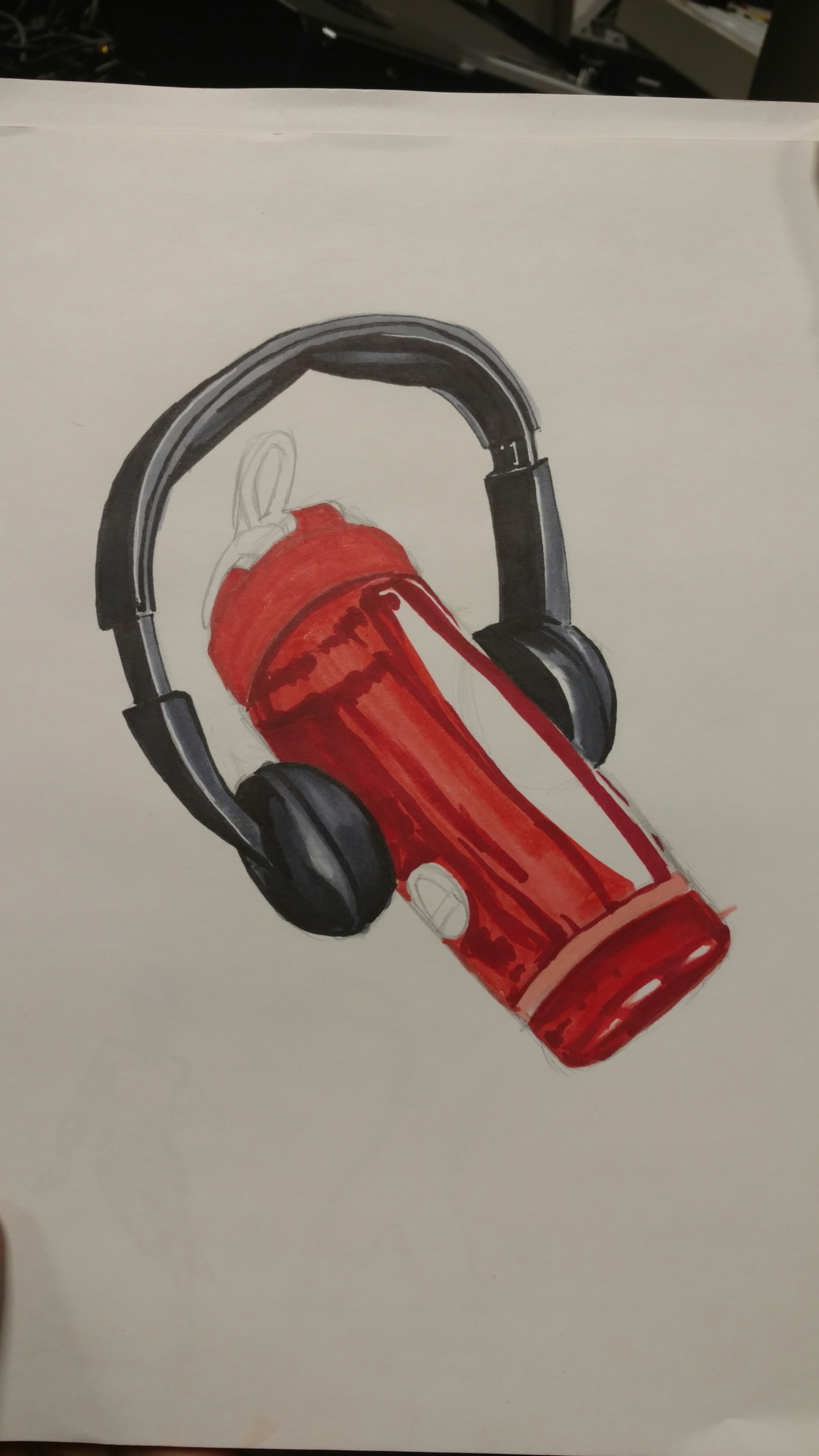
    Now that I’m happy with it, I can begin to blend my colors and perform little tweaks that are required for the look I’m after.

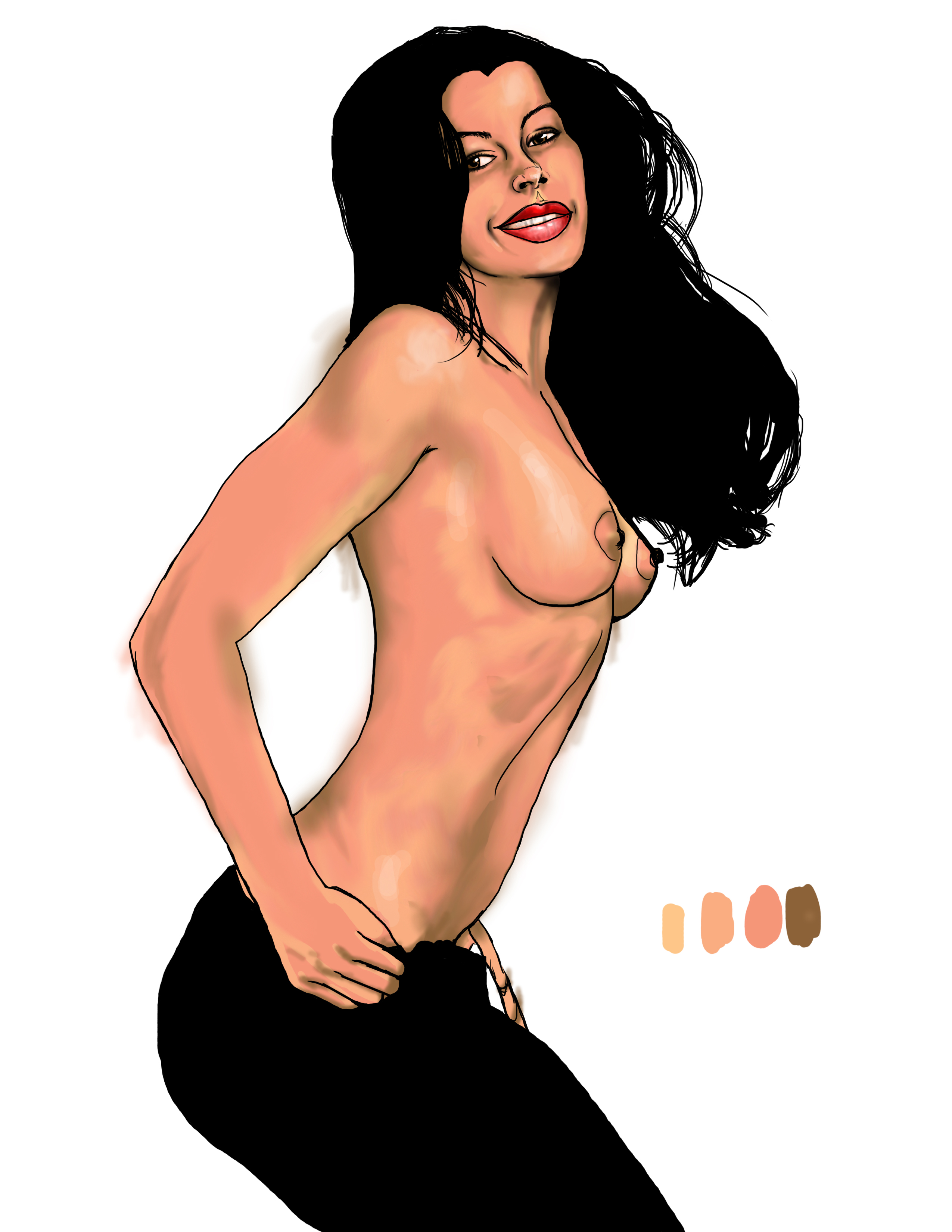
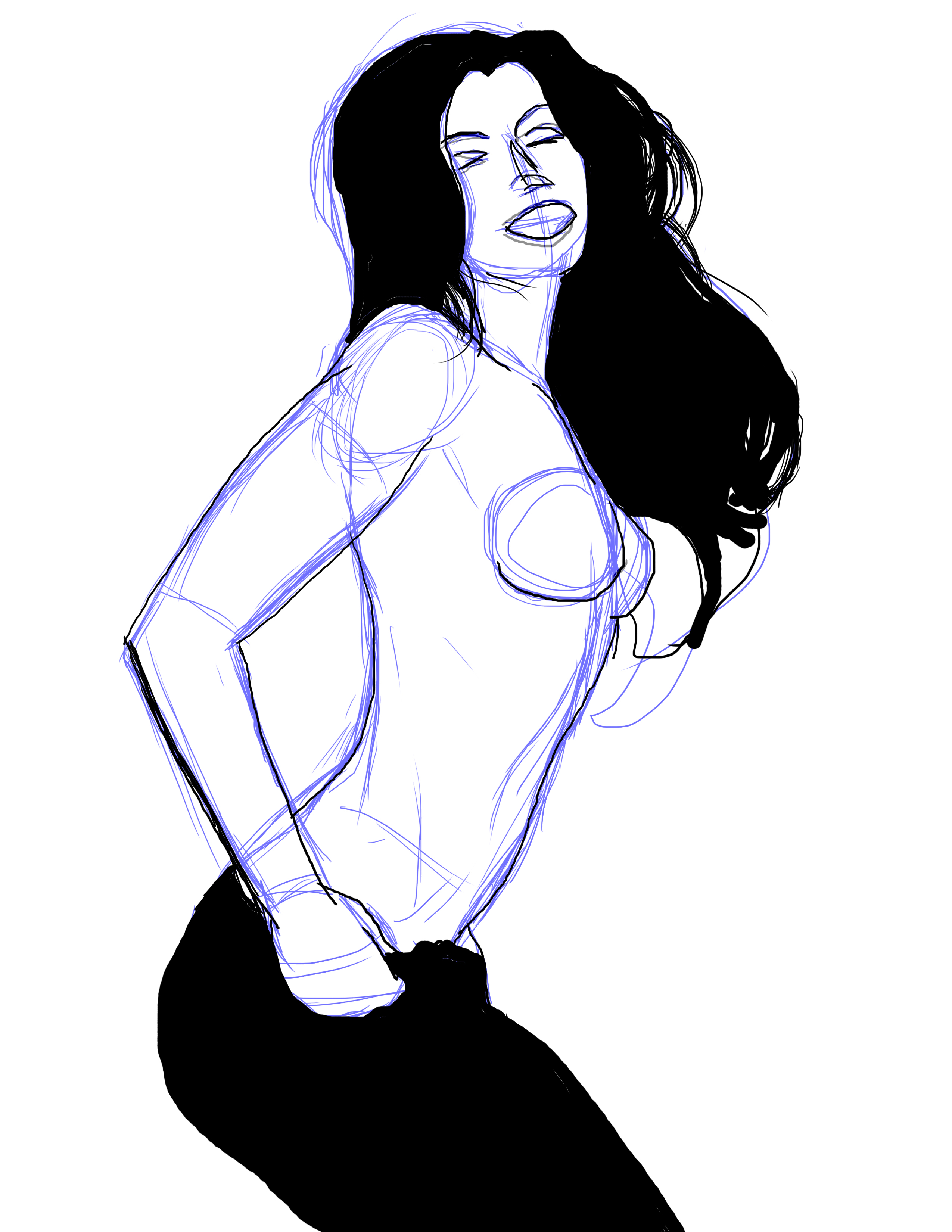
     Now all I need to do is clean up my Image and give her shadows a little depth by cooling them off.

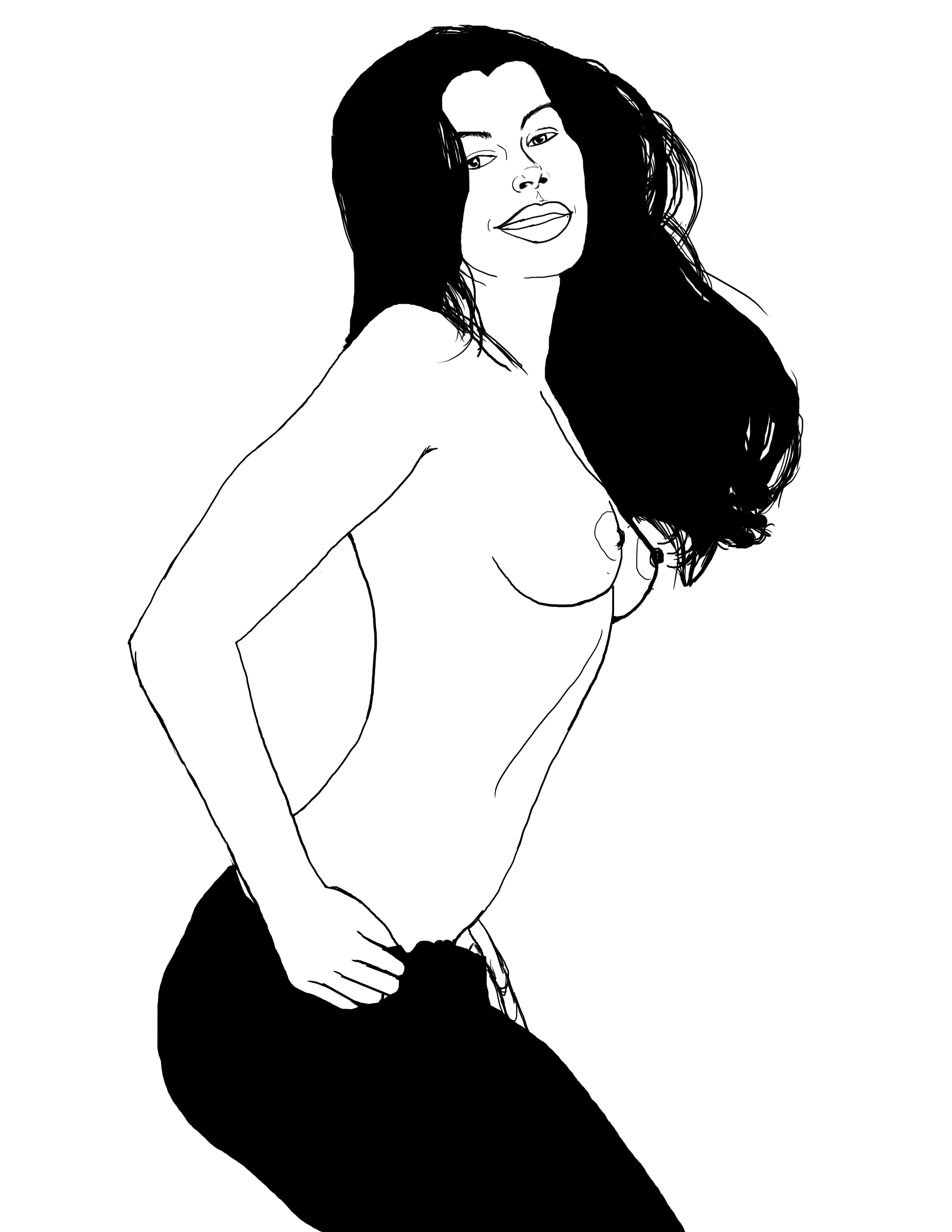
    A lot of these things become easier with time. Give them a try!

Advertisement

Recollect

    All of my favorite people seem to be either dead or out of my life in any meaningful way. That’s the kind of observation that can ruin your holidays!

I’m sure I’ll be fine.

     So last week I decided to do an online tutorial, live on Facebook. It was pretty successful; I had no idea so many people were interested in Prismacolor shading process for markers!

    A couple of people told me I had a unique look and wanted to know where I learned it. The school of trial and error was my reply. Sure, I’d like to be able to have the style of an Artgerm or Warren Luow, but I’m proud of coming up with my own solutions.

   Having said that, I often find myself inventing a wheel that already exists. But the process of finding and implementing the solution teaches me a lot.

     This will never end for me. I’ll always be learning something new and exciting in art. Always picking up a new technique. When I look at my old stuff all I see is what I did wrong! 

Rather than get discouraged, I take it to heart. If I wasn’t growing in both knowledge and experience, it would still seem fine to me. If your stuff from a few years back still looks great to you, you’re stagnating.🙁

     While I’m content with the praise I received last week for this image, I know that next year I’ll cringe a little looking at it. 

      It’s only natural.

Friends with Adversaries

    Sometimes I can slip in a picture at work and this is one of those times. Think of it as an art study, the kind teachers usually put on a person the middle of the room.

     The drawing itself wasn’t the hard part. I knew the translucent quality of the bottle was what would try to kick my ass, so I begin by gameplaninng it first.

     Of course I couldn’t ignore the headphones! Getting the textures right proved to be technically easy. Harder edges with more separation in values gave things that hard plastic sheen.

    Now came the bottle itself. I began by laying out my mids and leaving highs as page white for now…

    …after which I begin to add reflections by using a darker red. It gave the illusion of a highly reflective surface, which made for a good starting point.

     From there I chose the original color I used to create my mids to add gradation to the bottle. It helped create the outline of the other speaker, as well as the twist grooves for the cap.

   Finally I used Deco Peach to go over the entire thing and add a bit of glossiness to the bottle. A white gel pen created the lettering and logo and it was done!

    I hope you guys like the end result.😊

Keep it Apart

       So with #inktober fast approaching, my apprehension about my upcoming project is high. While I believe in my abilities, it’s a pretty daunting task!

   Luckily for me, I’m used to producing results in a timely manner. This past year has left me with huge improvements in my skillset; the script writing was a new skill as well as inking. 

    Lots of artist will be participating this year, so I’m honestly excited about the prospect. Hopefully I impress a lot of people, but the experience will tell me a lot. 

    In the meantime, I’m wrapping up all the pending images I had to complete, like this one. Some people aren’t expecting theirs yet. Oh well… I’m not going to rush, but come Friday, I expect to have completed five.

    I’ll be posting here of course. You guys will get to see plenty of work. 

Color Blind part 3

image

      So now we’re ready to add color to the image first I select a new layer and change it’s setting to color. I do the same for the brush, softening and lowering it’s opacity as well. I like to add color in strokes so it feels more like painting. Plus I don’t really clean up my brushstrokes. I like a little roughness to my art!

image

      Remember to add any layers of color necessary to achieve the look you’re after. Flatten your image when needed; it’ll save file sizes from getting out of hand. I leave mine in so that you can see the steps in the photos.

image

        The background color felt a little too dominant compared to the foreground. I use the hue/saturation tool [ctrl/cmd+u] to change the color and lighten it.

image

        I still have a little work to do, but you get the idea. Try to choose your palette BEFORE you get to that last step. It’ll make life a lot easier. Have fun!

Color Blind

image

      Didn’t I promise you guys a greyscale image that I’d color by blending them in?

      I can’t remember….

      It doesn’t matter though, cause I’m doing it anyway! I begin by drawing my subject from a very bad phone shot. No, I won’t show it; I’m a videographer my rep would suffer! Besides, this is really just a sketch. Once it’s done I began by changing the color and opacity. I create a separate layer for all the line work needed. Always make sure you’re using hard edges at this stage.

image

      Once you’re happy with your line art you can divide it up if you choose. I always put all the interior detail work on a separate layer, so that I can change it to go with my color fills. I’m pretty sure that’s not standard or anything,  it’s just something I prefer.

image

       Today I took a cloud brush and stamped in some green clouds. Why? Hell if I know!  Just kidding. I actually have an idea kind of bouncing around in my skull. After that I create another layer and use the selection tool (w) to outline the main layer of art. If it doesn’t come all the way into the line, choose [Select> Modify> Expand ] to increase your selection edge by increments of pixels.  So much fun!

      Once you’ve gotten a good setup, make sure you have the interior of your outline. It you see your selection ants on the border as well, press [Ctrl/Cmd +shift +I] to invert your selection. The next step is to pick a midrange color and using either your brush or paint bucket,  fill the selection area. Pretty easy, right?   
      That’s it for now. I’m going to go drink and play while you practice. Just like a real teacher…

Everything Needed

image

    Last week, I showed you how far I’d gotten but not the steps before. Yeah a lot of things change when you’re working on a picture. For example…

image

image

         In the earlier versions, something kept bothering me. Once I began shading it came to me; her left I seemed wonky! Now, I could have went back to the beginning and redress it on that layer, but instead I simply erased it.
         Using the magic lasso(W), I drew a selection around the other eye, then copy merged the area. Make sure you choose copy merged from the edit menu, otherwise it will only copy the selected layer of art!
         After you paste a new copy, move it to the area. While still highlighted, go into your transform set and choose ‘flip horizontally’. This will create a mirror image of the other eye. Of course, it can’t look exactly the same, so I recommend using your skew and rotate functions to align it properly and scale it correctly. In my case, I had to select the pupil, move it to create the illusion of looking forward and then shade the area.

image

She looked a little like Popeye before I fixed her eye...

     Remember, the most important part of your image is the linework proceeding the actual coloring. However, if you make a mistake, you can always fix it.  That’s all for me, I gotta get back to drawing!

I LOVE to Prey

image

      In the midst of everything I was going through, I had gotten a long way on this picture.  It wasn’t until this morning however, that I remembered to post this!  I’m definitely off my A game…

     As you can see I’ve been blending in my shadows and highlights for this image. The way I usually do this is to take whatever layer of color I’m working on and, using my selection tool (W), I select all of that color. Once you’ve done that, create another layer above your resource layer and press Ctrl+Alt+G. This will create a clipping mask from your selection, allowing you to color or draw at will without bleeped from your parameters!  No more line tracing and erasing!

image

The down arrow next to the layer denotes a clipping mask

      My next thing may just be a “me” choice, but it’s worked and I’ll use it until I find a way that works better for me. If all my colors and art agree, I’ll make a copy of the psd file and flatten the image. From there I use the smudge tool to blending and mix in colors. The reason is because it doesn’t give a completely perfect gradation, which looks more realistic to me. I have my own, but my favorite is a tri-point brush I got from an artist named Genzoman(deviantart name).

         Well I’m off to work.  Hope you have a great day and do your best!

Reality

image

      Well, as much fun as I’ve had in the last few days doing traditional stuff,  you just knew I was going to get back to drawing the new fashioned way. My newest muse is a cosplayer named Callie and hopefully some of you recognize her from her page. Her linework was done with a hard edged brush set at 7. The detail lines were done on a separate layer at 4. I didn’t clean up my lines yet; once I get into a zone, certain lines are done over and over until I feel that they look fairly accurate.

image

      Once the lines are done, I grouped all of those layers together and lock them. Believe me, you don’t want to spend ANY time fixing a dumb ass mistake now!

     Next I began to add colors. Under a different group, I create a layer for hair. I’ve decided that (a)I’m going to start with muted versions of the final colors for mood and (b)I’ll use colors already in my swatches. If you look really closely, you can pick them all out in the screen grabs.

image

      With the skin, I decided that a little bleed over is good. It will help later to create the effect of her wearing objects, as opposed to them merely sitting on her. What about her eyes and lips, you say?
Stay tuned…

image

      This will be the bottom layer of this group; the next two are above it. Again I pick the flattest color for my fill, allowing me to add a clipping mask to any layer in order to work it.

image

image

      So clearly there is NO silver on Miss Amazonia in the real image. There won’t be here as well. I’m using the color and mixing it later to create a sheen on the bronze. You’ll like it, trust me.

     I’m feeling a little under the weather, so I don’t think I’ll get a lot done today; but believe me, when it’s done I expect to be pleased! Have a fun day!