Tag Archives: photoshop

Illicit Response

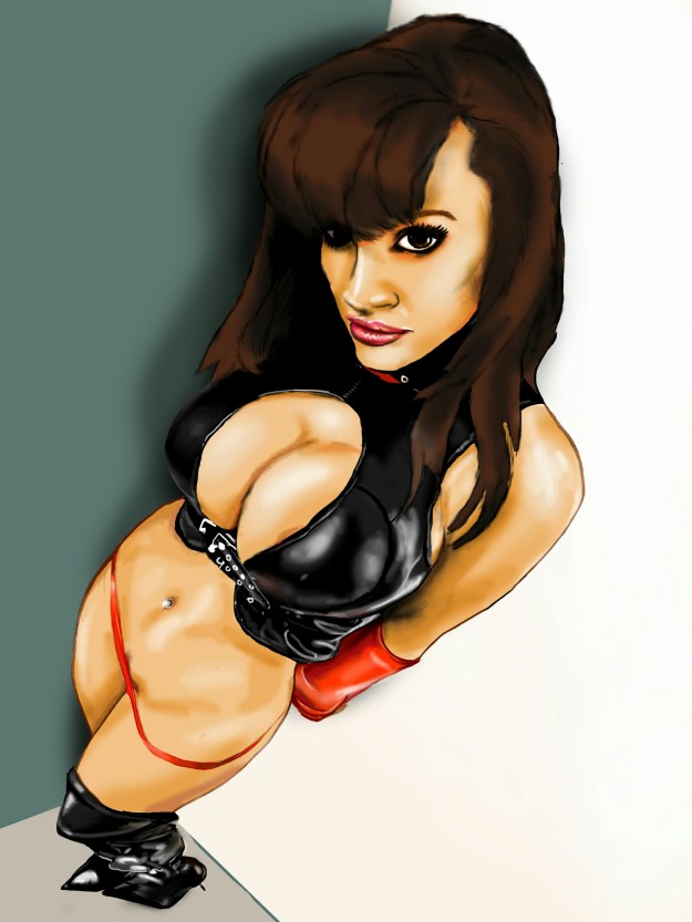
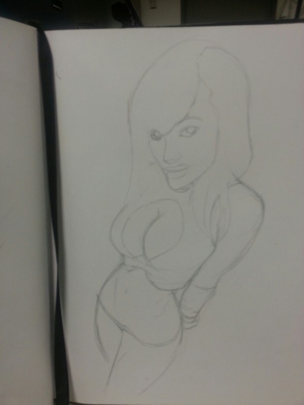
     Okay…. I’m not sure about the age of my audience. I drew this pretty quickly, so hopefully no one gets upset. Ready? Here we go…

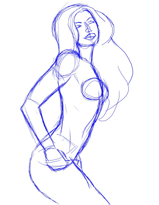
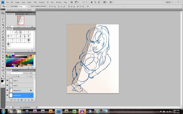
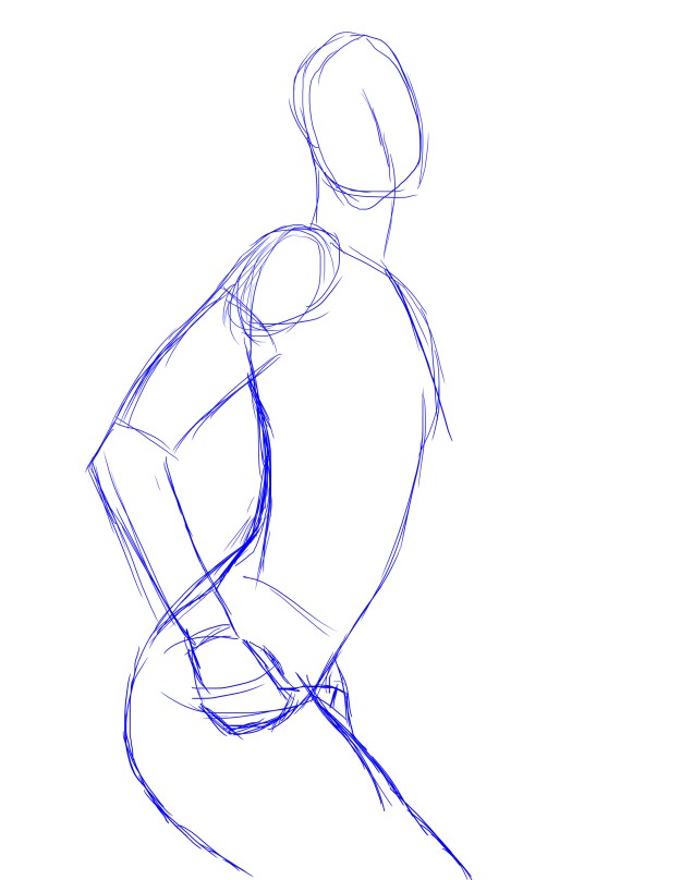
    So as much as finished pieces gets all the glory, it’s the ground work that makes it all come together.

      I honestly was never one for sketching in the past. If I had an idea, I would just dive right in, no plan, just improvising as needed.

     But as I got further along in my career, I learned that having a plan isn’t necessarily a bad thing! It actually helps to know in advance what you’re doing. It helps in a lot of ways.

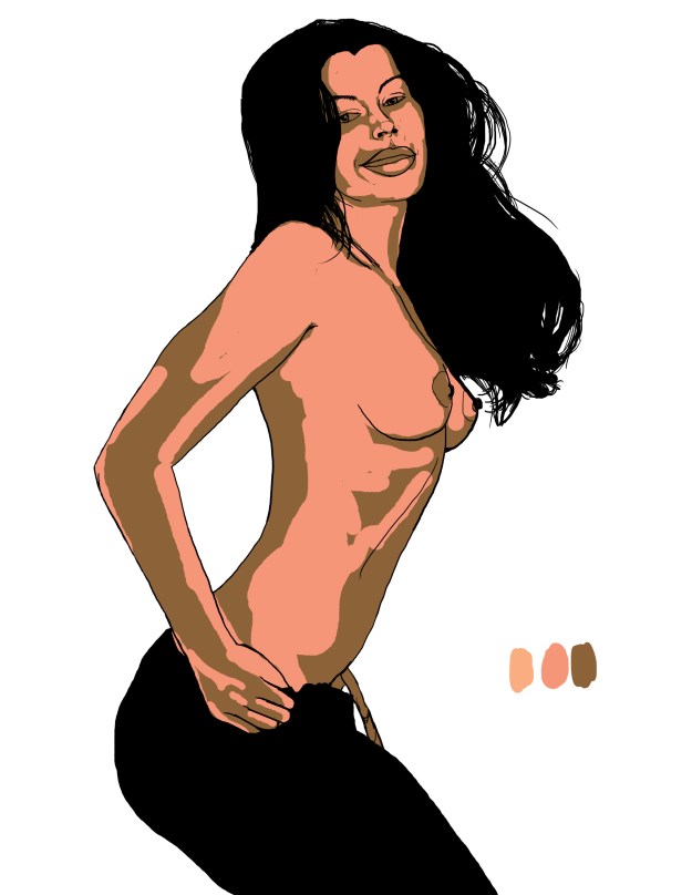
    For instance, I already knew ​where my light source would come from. It made layering my skin tones a LOT simpler.

    Having a good layout helps with the speed I’m able to use here. I can reverse the image to make sure I have the balance needed.

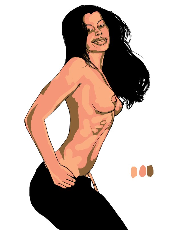
    Now that I’m happy with it, I can begin to blend my colors and perform little tweaks that are required for the look I’m after.

     Now all I need to do is clean up my Image and give her shadows a little depth by cooling them off.

    A lot of these things become easier with time. Give them a try!
Advertisement

Be

    Yay! I actually got permission to post my digital art! Maybe I was wrong to give the choice, but I feel that portraits​ are kinda personal. 
     I’ve been so busy with repairing my home. It’s a little over one hundred years old and it’s last update was in the 80’s. I’m not trying to go too modern, but things like floor sag and bad rafters come before the pretty stuff. Foundations first!

     Maybe I should just enjoy this period of my life. After all, it hasn’t been this quiet in a long time. No impending doom, just everyday things. I should be content.

    Ha! Who am I fooling? Even though it’s true, that’s just not my nature. After a decade of nothing but one emergency after another, there is no way I could fully believe that calm waters are ahead. But is that experience or paranoia?

    I gave up on happy. It abandoned me. My world has been mostly grey with occasional flashes of color. I’ve come to accept it, even appreciate those rare instances.

    Was I wrong? Could it be?

     Here’s the truth; I WANT to be. I really do. I know it’s a little like giving up on life the way I live. But I’m not sorry. It’s my way of… I’m getting my affairs in order. That’s all I’ve been doing. Stalling in the hopes that it isn’t necessary, but keeping my distance from life so that I won’t mind parting with it.

    Dammit.

   Okay. I need to start doing more than getting by. I need to find joy in little things. Like my art. It doesn’t need to be complicated because now I know what I want!
  I want to be.


More Good News for Bad News

    My time for art has been rather tight lately. If I’m not doing stuff like the image above for clients, I’m editing videos and doing photography. It all adds up, so I try not to think of it as work. That would kill the vibe, lol.

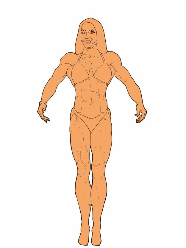
    In the meantime, it’s always a joy to find an hour or two for my own personal projects. This weekend was such a break. I went to my local Starbucks, sat down and begin this picture. Actually had a guy get upset when he was informed that the person in the picture was a girl. Silly dude, strong girls rock!

So since this is the month for it, expect a few more strong women 😉

Color Blind

image

      Didn’t I promise you guys a greyscale image that I’d color by blending them in?

      I can’t remember….

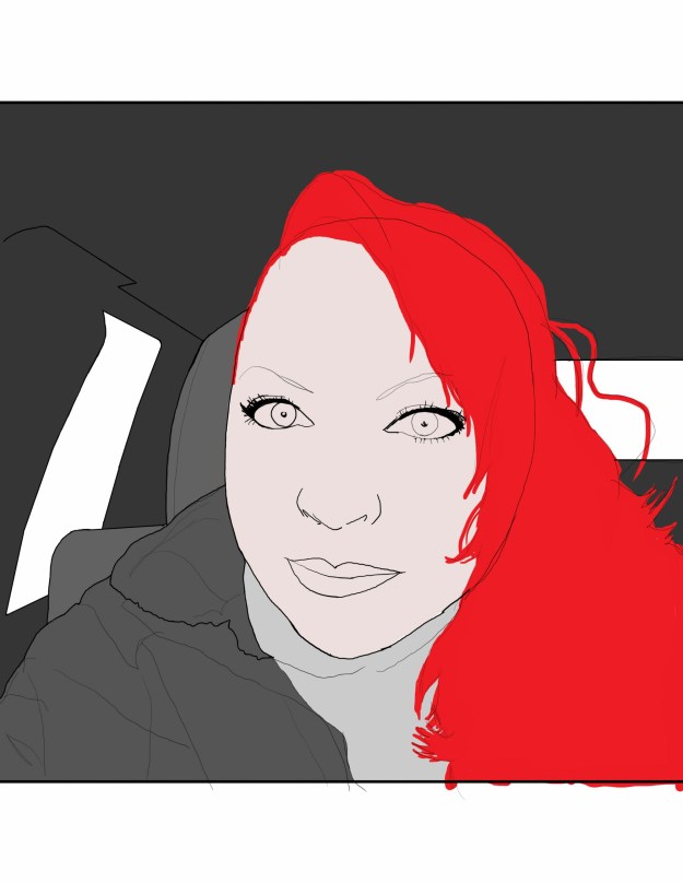
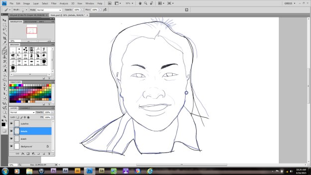
      It doesn’t matter though, cause I’m doing it anyway! I begin by drawing my subject from a very bad phone shot. No, I won’t show it; I’m a videographer my rep would suffer! Besides, this is really just a sketch. Once it’s done I began by changing the color and opacity. I create a separate layer for all the line work needed. Always make sure you’re using hard edges at this stage.

image

      Once you’re happy with your line art you can divide it up if you choose. I always put all the interior detail work on a separate layer, so that I can change it to go with my color fills. I’m pretty sure that’s not standard or anything,  it’s just something I prefer.

image

       Today I took a cloud brush and stamped in some green clouds. Why? Hell if I know!  Just kidding. I actually have an idea kind of bouncing around in my skull. After that I create another layer and use the selection tool (w) to outline the main layer of art. If it doesn’t come all the way into the line, choose [Select> Modify> Expand ] to increase your selection edge by increments of pixels.  So much fun!

      Once you’ve gotten a good setup, make sure you have the interior of your outline. It you see your selection ants on the border as well, press [Ctrl/Cmd +shift +I] to invert your selection. The next step is to pick a midrange color and using either your brush or paint bucket,  fill the selection area. Pretty easy, right?   
      That’s it for now. I’m going to go drink and play while you practice. Just like a real teacher…

Mayk

image

    Back to work!  This is the last of the fitness competitors that I have to draw. Needless to say it’s been a long series of drawings to get through. Couple that with a few requests to NOT be featured here and you can see I’ve got a real sense of relief.

image

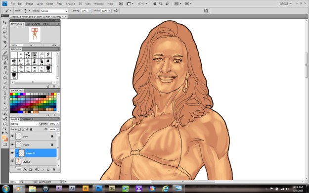
      The way I go about these steps tends to vary, with me frequently simply going by feel. This time I decided to go with using a brush set at 30percent with reduced hardness. I color in with a larger version to block in my areas of light. Then, using a smaller setting, I add detail to this layer.

image

      The reason I can concentrate on just shading is because I made this layer a clipping mask of the one below. Trust me, unless you enjoy doing line clean up, this is MUCH easier.

Happy New Year!

image

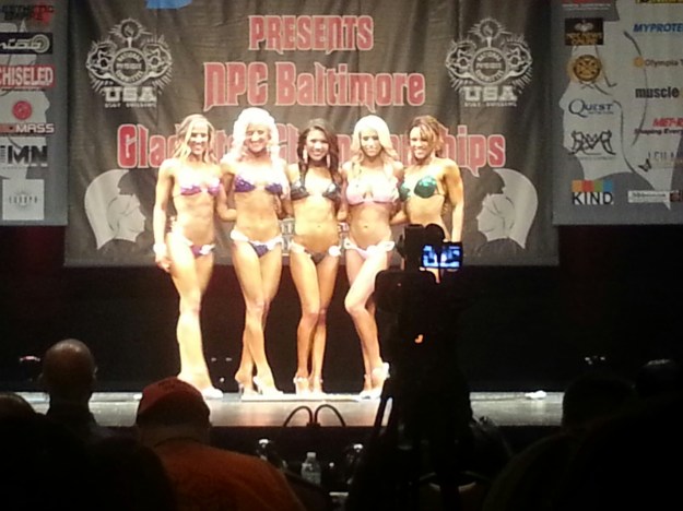
      Yay, I finished my picture!  Hugs all around. Even though I missed the bodybuilding show that a lot of customers attended,  a couple of people sent me pictures…

image

      Of course I have no idea what I’m going to do with them. All the images,  coincidentally, are of the female competitors. And this far away. At least they were being helpful,  so if you’re reading this, thanks.

      To be honest a lot of my energy right now is being expended on getting my home repaired. But hey, if you can’t make time to draw, what’s the point?

Dirty Souls

image

     I spent most of this morning correcting the line art and making a scrumptious crotch for this image. It wasn’t hard actually. Even though most of the work went easily enough, I still have a hard time giving her a good background.

image

      After changing the color and adapting my shadow layer to her light source, I decided to stop here.

image

          I’ll finish the hair later, promise.

Maliciously Innocent

image

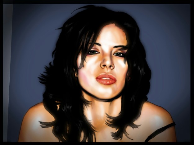
      Some of you may have noticed that my workflow on this image has been a little bit different. I started with my sketch and didn’t bother to clean up my linework at ALL. I even laid my colors down on one layer. What gives?

      I’m trying to show you guys that there’s more than one way to get the job done. A lot of people will try to convince you that there’s only one and its theirs. But you honestly have to try different techniques!  For me, my style is an amalgam of all of my influences; sci fi, comic books, anime and porn. Yes porn.

image

does it show?

        You may have other graphic styles influencing you. Go for it! It’s okay to copy someone else’s style when you’re starting out, but eventually you will notice that you admire bits and pieces of a lot of artists.

image

       You may have noticed that I brushed my flat colors in then used my burn and dodge tools to get tonal range on the skin.I’m not going for realism here, more of a cartoon style effect. Later I’ll add shadows and highlights with a soft brush set at about 20% opacity. I used this on the leather and her cleavage and got a pretty good effect.

     Don’t be afraid to experiment. It may not always work out, but it will always pay off.

Pretty People Don’t Lie

image

     There’s a reason now for why this isn’t linked to my Facebook page. I’m being harangued by a lot of pretty girls to draw their images. Remember the redhead I was drawing for awhile? Well she’s a close friend (eyes front buddy, no hanky panky here) and she put the word out.

       Anyway…yes the above image looks a little sketchy. Usually I would do my lines and delete it; it never occurred to me that I was leaving out a whole step in my process. My bad!

image

Maybe this step too?

     Lately I’ve noticed that my hand shakes. Not a lot. I’m sure a normal person wouldn’t notice,  but the ability to create smooth arcing lines is kinda useful. I’ll admit that formal training may help, so I’m going to take some art classes next semester. Stay tuned…

Everything Needed

image

    Last week, I showed you how far I’d gotten but not the steps before. Yeah a lot of things change when you’re working on a picture. For example…

image

image

         In the earlier versions, something kept bothering me. Once I began shading it came to me; her left I seemed wonky! Now, I could have went back to the beginning and redress it on that layer, but instead I simply erased it.
         Using the magic lasso(W), I drew a selection around the other eye, then copy merged the area. Make sure you choose copy merged from the edit menu, otherwise it will only copy the selected layer of art!
         After you paste a new copy, move it to the area. While still highlighted, go into your transform set and choose ‘flip horizontally’. This will create a mirror image of the other eye. Of course, it can’t look exactly the same, so I recommend using your skew and rotate functions to align it properly and scale it correctly. In my case, I had to select the pupil, move it to create the illusion of looking forward and then shade the area.

image

She looked a little like Popeye before I fixed her eye...

     Remember, the most important part of your image is the linework proceeding the actual coloring. However, if you make a mistake, you can always fix it.  That’s all for me, I gotta get back to drawing!