Tag Archives: techniques

Burn Baby, Burn

Hey guys! Sorry about last week, but as some of you know I work in the wonderful wacky land of Washington DC. So…last week was hectic and interesting. ’nuff said.

THIS week has been a bit challenging to me. I’ve started the banking process to having a new home! Because hearing my neighbors constantly during a quarantine is a terrible fate for me.

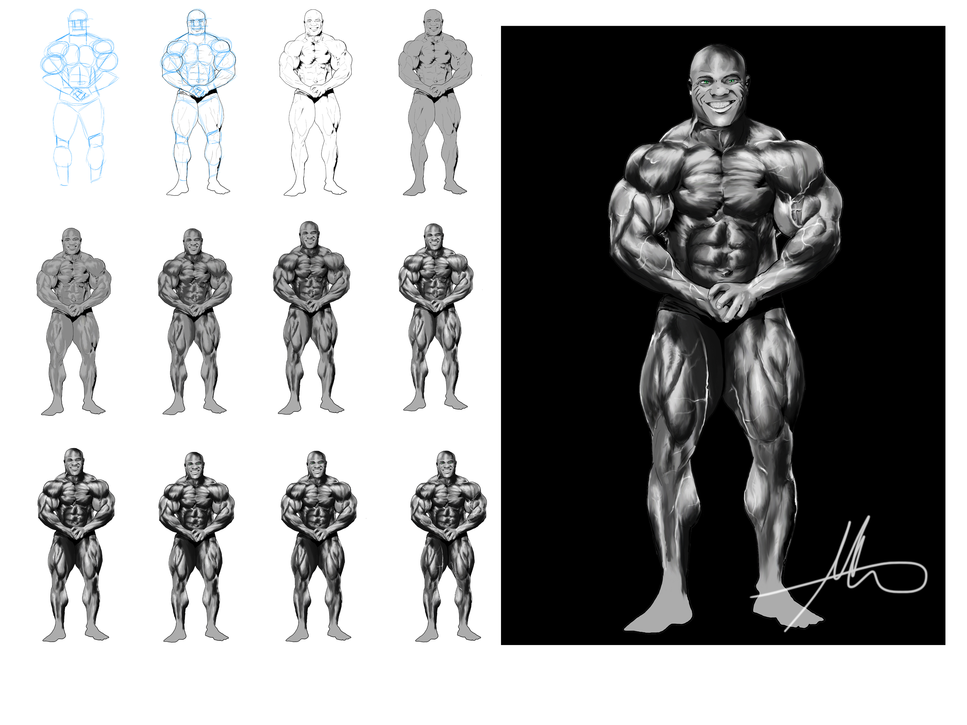
I know that some of you miss the different steps being shown; I want to include those too, but that would entail me scripting my workflow and honestly?…

I don’t know if I can.

Once I’m going and into the flow, I kind of forget that there’s a world outside of my focus. That’s why the videos have been easier; no need to remind myself to take a snapshot.

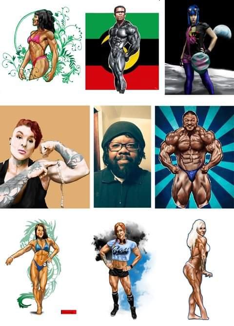
Still… I managed to make a collage for an event for this year. Will it happen? So far it’s hard to say. But at least you can see what I look like 🤣

Anyway, it’s nice to work from home again. I definitely don’t miss my 1.5 hour commute!

Here’s a timelapse of my latest portrait. I always feel weird about showing my initial sketch. I’ll probably start omitting that and leaving in the linework. We’ll see.

Have a great week 😊

Advertisement

Feel Good

image

     I’ve started a new image and a new process. I’m drawing Optimus Prime! The beginning is easy; I start out with a basic wireframe style sketch to get the pose right, then fill in and make his basic shapes. A trick I picked up from my more technical design friends is to get a couple of shape stencils. These things are awesome!

image

The stencil was a wise $5 investment

image

       Once again the equipment given to me by Westwood College has been an enormous help. I’ve already laid down my lines, now I simply began to shade in my shapes with my prismacolor markers. Think of these surfaces as a collection of individual cubes. Pick your lighting source and direction. Shade accordingly.

image

image

Finish allof one color, then work the next

      So far so good. To make sure I’m doing a good job at the colors, I have a test pad for my blends. After all, they need to compliment each other…

image

image

Something metallic to reference light sources

image

     Finally its time for the middle area. I decided against the chrome look and went for a flat metallic feel.

image

image

That's just prime!

     Anyway, that’s my quick drawing of Optimus. I think I have a drawing of the Mighty Orbots in me soon. We’ll see…

The Wall of Why

image

     Listening to Sugar Ray while sitting in my art room drinking shots.  How old school is that? I’m actually adding my shadow layer now. Since shadows are never actually black (unless you’re that feeb, batman), I try to pick a color that’s on the far end range of the neutral skin tone I chose. Also, an overall warmth will be a part of this image so instead of a cooler version I went with a reddish brown.

image

     I’ll admit that I have no real preference as to where I start my shading process. I’m sure there’s probably a very technical reason for it; to me it simply feels right. Lately I’ve been reading about how digital art seems “soulless” to some. As a personal choice I try not to completely smooth out my shadows and layers of color. I actually like my stuff a little rough! Again no true reason for it, other than it appeals to me. Could it be that I’m starting to develop my own style?…

Maliciously Innocent

image

      Some of you may have noticed that my workflow on this image has been a little bit different. I started with my sketch and didn’t bother to clean up my linework at ALL. I even laid my colors down on one layer. What gives?

      I’m trying to show you guys that there’s more than one way to get the job done. A lot of people will try to convince you that there’s only one and its theirs. But you honestly have to try different techniques!  For me, my style is an amalgam of all of my influences; sci fi, comic books, anime and porn. Yes porn.

image

does it show?

        You may have other graphic styles influencing you. Go for it! It’s okay to copy someone else’s style when you’re starting out, but eventually you will notice that you admire bits and pieces of a lot of artists.

image

       You may have noticed that I brushed my flat colors in then used my burn and dodge tools to get tonal range on the skin.I’m not going for realism here, more of a cartoon style effect. Later I’ll add shadows and highlights with a soft brush set at about 20% opacity. I used this on the leather and her cleavage and got a pretty good effect.

     Don’t be afraid to experiment. It may not always work out, but it will always pay off.

Taking steps

Heath_breakdown

for smudging, I built my own brush


Since I’m starting to get ” how to” questions, I hope these pic that I’ve made will help. For shading I never use the dodge or burn tool, preferring instead to use smudging. With about 52% opacity on the tool I get a fairly sketchy look. To me it feels more like actual drawing that way. I used to until recently lay down the mid tone first, then add the shadow or highlight later. nowadays I start from the darkest. I do this by squinting at my subject and dividing the lighting into three layers.

when I need an inbetween color I take my brush tool reduce its hardness to zero, opacity to 34% and slowly add a bit of each color until I get the one I need. Its hard to explain, but if you look at my piece called Baklumps you should see an example of the technique in the corner of that pic.