
Look at the wonderful gift my son left me! And on my beginning day of getting ready for next year’s Jay Cutler Classic. What a thoughtful present!
….
I’m gonna throttle that kid.

Look at the wonderful gift my son left me! And on my beginning day of getting ready for next year’s Jay Cutler Classic. What a thoughtful present!
….
I’m gonna throttle that kid.

Had a slow day at work today, what with the snow and all, so I finished editing a video and let it render. While waiting I decided to do a little drawing, old school style.

What do you think? Anyway, the reason I’m so happy is because my life sucked recently.
I fixed it.

While at home Friday, I was watching the news here in Baltimore and noticed something amazing; our weather lady was hot! Yes yes, they put cute heads on television all the time, but this was different. This girl had a porn worthy body and they almost NEVER let women like that on air. (except Galavision and Univision, bless you both)
When I worked out of the DC bureau for ABCNews, we noticed this. Some of the PA’s definitely had custom car bodies, but the producers preferred the more model types. The fact was if you were simply stunning, you probably didn’t get to go on air. Maybe they wanted the women to not be too pretty or sexy, maybe the old duffers upstairs had a type and only picked it. But it was definitely discriminatory towards certain types of beauty.
So here I was staring at someone who met that mold, on air! I guess times are changing. It might be a good sign. After all, for many ethnic women you could only be two types, big mama or beanpole. It’s cool to see an average woman with an adult build make it. A little less hypocrisy is always a good thing.
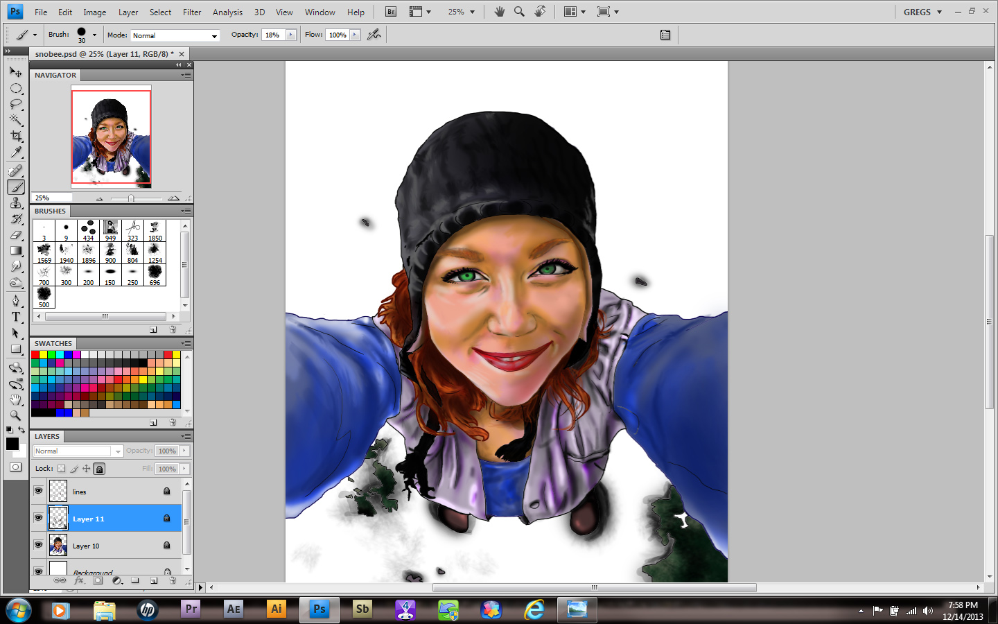
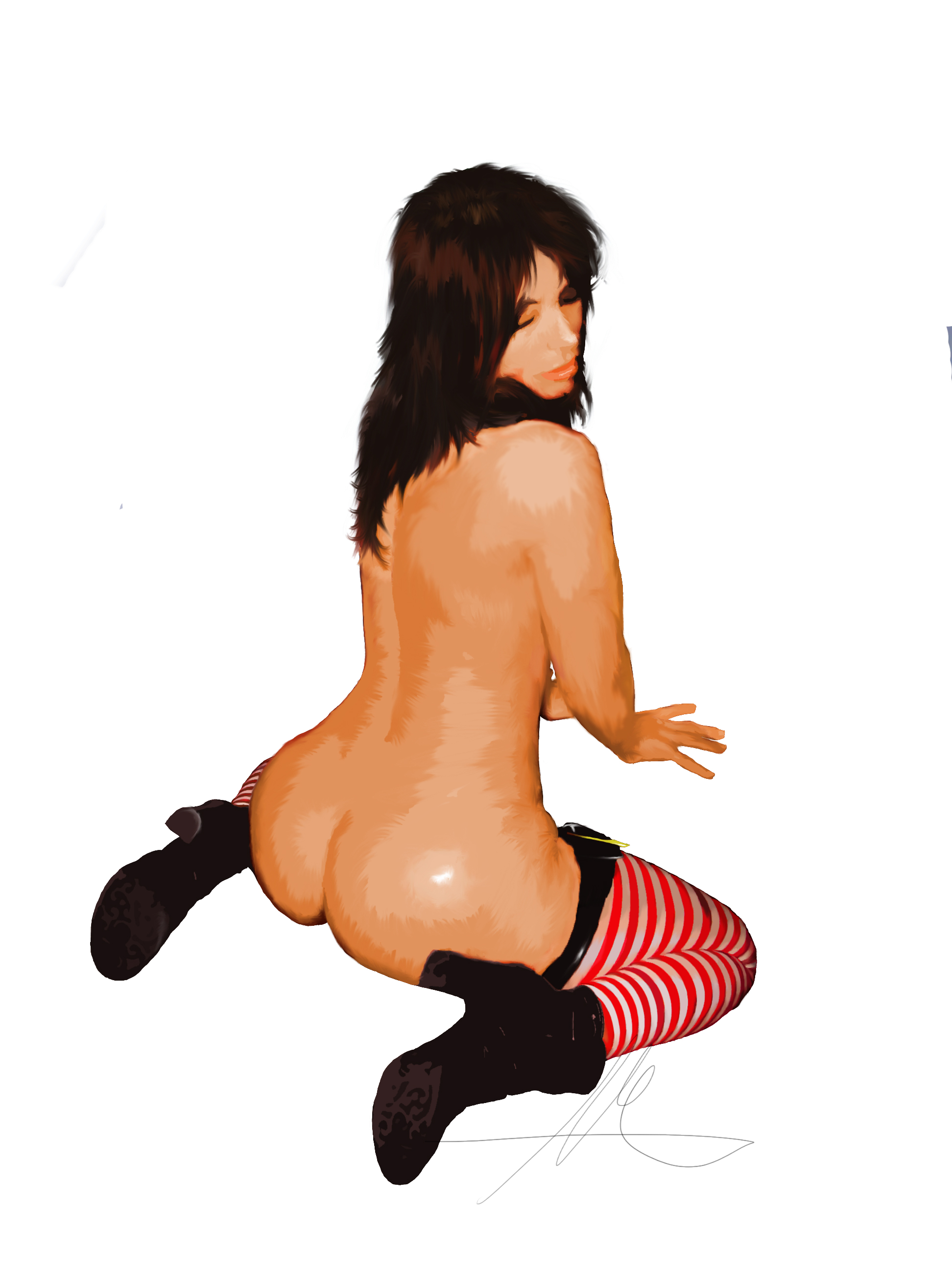
As you can see, things moved right along on the image. It took about 6 hours, with me making myself not stare out my window. This one has a little more fun to it. I’m still debating on whether or not to add snowflakes in the image, but one idea had been playing around in my brain and that was to show the camera.

I’m a little iffy on the black and white effect around the edges, but she loved it, so it stays. Again, if you want an image of your choice to be next, please make a suggestion. The best one will be next month’s muse.
Sorry about the gap guys, I’ve been really busy with all the work I picked up from the bodybuilding show I attended. Add to that the gymwear and logos and…well, let’s say doing all that and working a full time job has left me short on time!
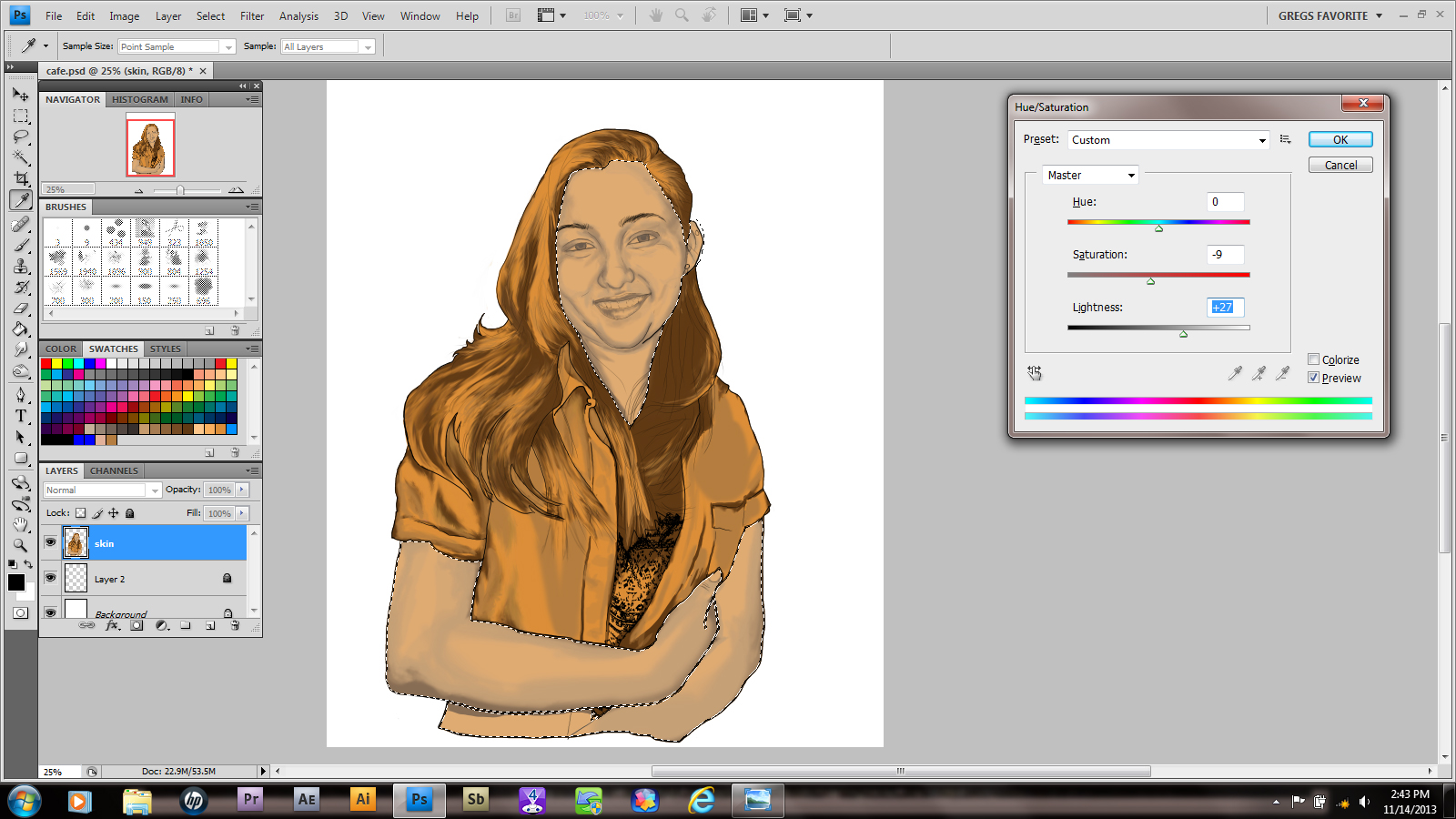
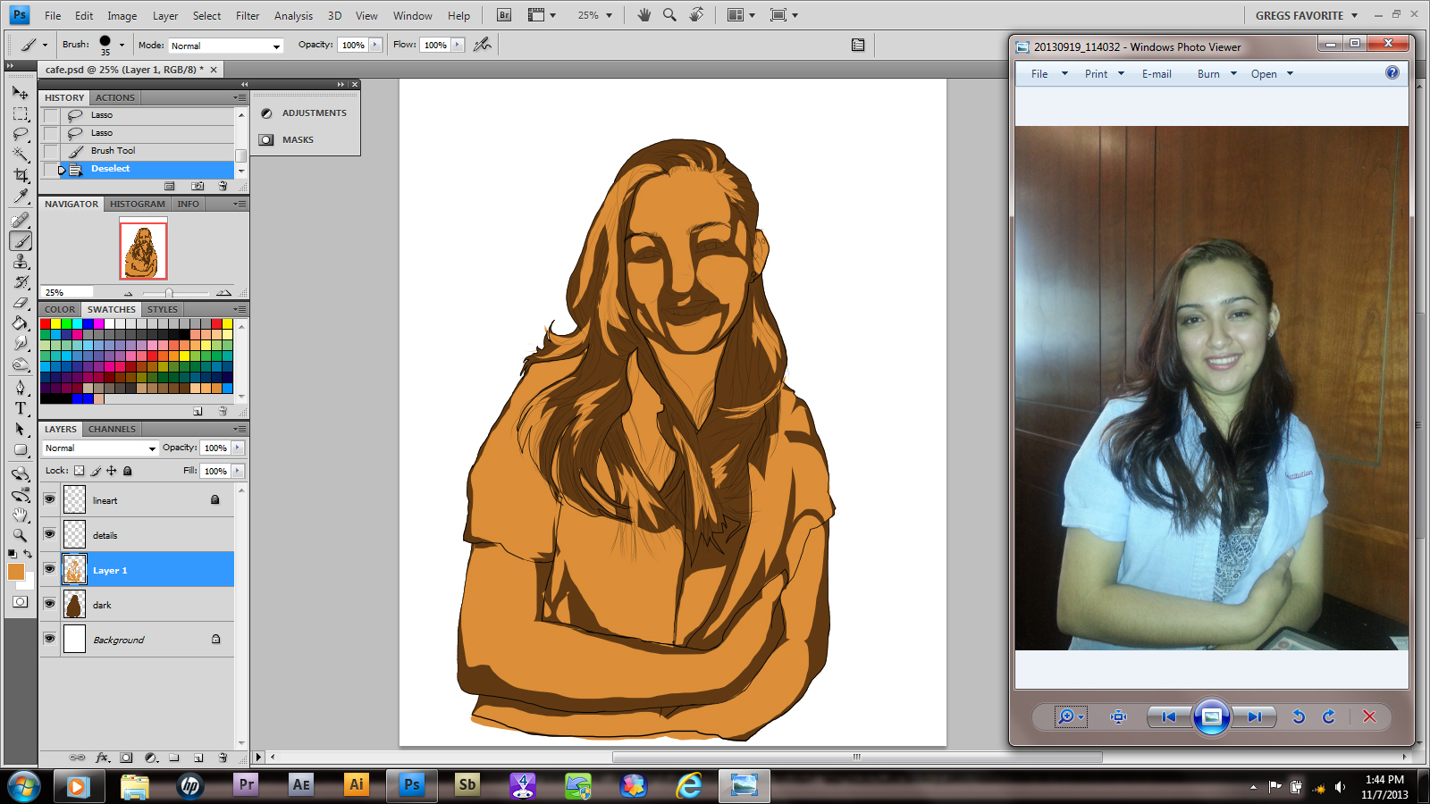
As you can see from the above photo, I pretty much got everything the way I wanted in the photo. Now I merge all my shading layers down into one layer. Then, using the lasso tool, I outlined all my skin tones. Finally, I use Ctrl+U to get my saturation tool to adjust skin color. Make sure you select the colorize box!

Little by little, select and isolate the colors needed to create the look you want.
Next, I began to add facial highlights. I’m going to be honest; If this picture were going for more realism, I wouldn’t use these at ALL. I mean, there’s no truly white areas on your body, right? (sorry vampires)
This step is optional, changing the line colors. I don’t always do it, but sometimes it works really well. Others…well, that’s what Ctrl+Z is for. Plus in the side by side comparison the image seems a little wide.

I added a background gradient, then erased a strip out of it. I’m not going to get too fancy with it. Besides, its a poster so I could put a year calendar, a memo spot or anything she wants there.
Hope you guys enjoyed the basic premise! Of course the hair will be done on the finished piece, but now you know how it’ll happen. Good luck and have fun!

In this portion there’s quite a bit more than there was in the last. Deep breath? Here we go!
We begin by cleaning up some of our brush work in the midtone layer. The first setup was the old squinty eye, where are my shadows technique. Now you refine all of that effort and create a new skin layer.

See the fuzzy coloring in the corner? Well, sometimes I need a color that isn’t exactly in my palette, that has to be a middle selection of two choices. At that point I take a simple brush, lower the hardness to zero and the opacity to the 50’s. Then I use my darkest and lightest colors of choice and blend them together until I get a fair range. That way I can select from this choice or even save the selection I make to the palette. It gives me a good inbetween color.
Anyway, once that’s done, I lower the opacity even more. Usually 36% works pretty well, depending on how slowly I want to blend in. I use this layer to begin blending the different values together. I can’t really tell you HOW to do this; everyone has their own level of ability. Still you can see the results it produces.

Here you can see a close up of me using this technique on the arm, as well as my brush settings. Pay attention to your blended edges!

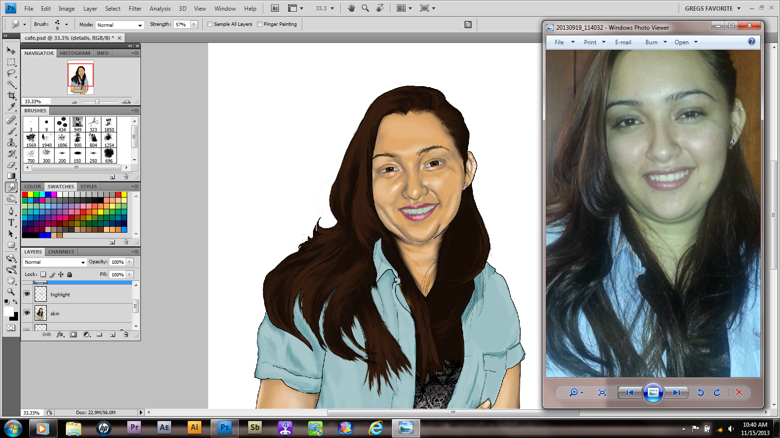
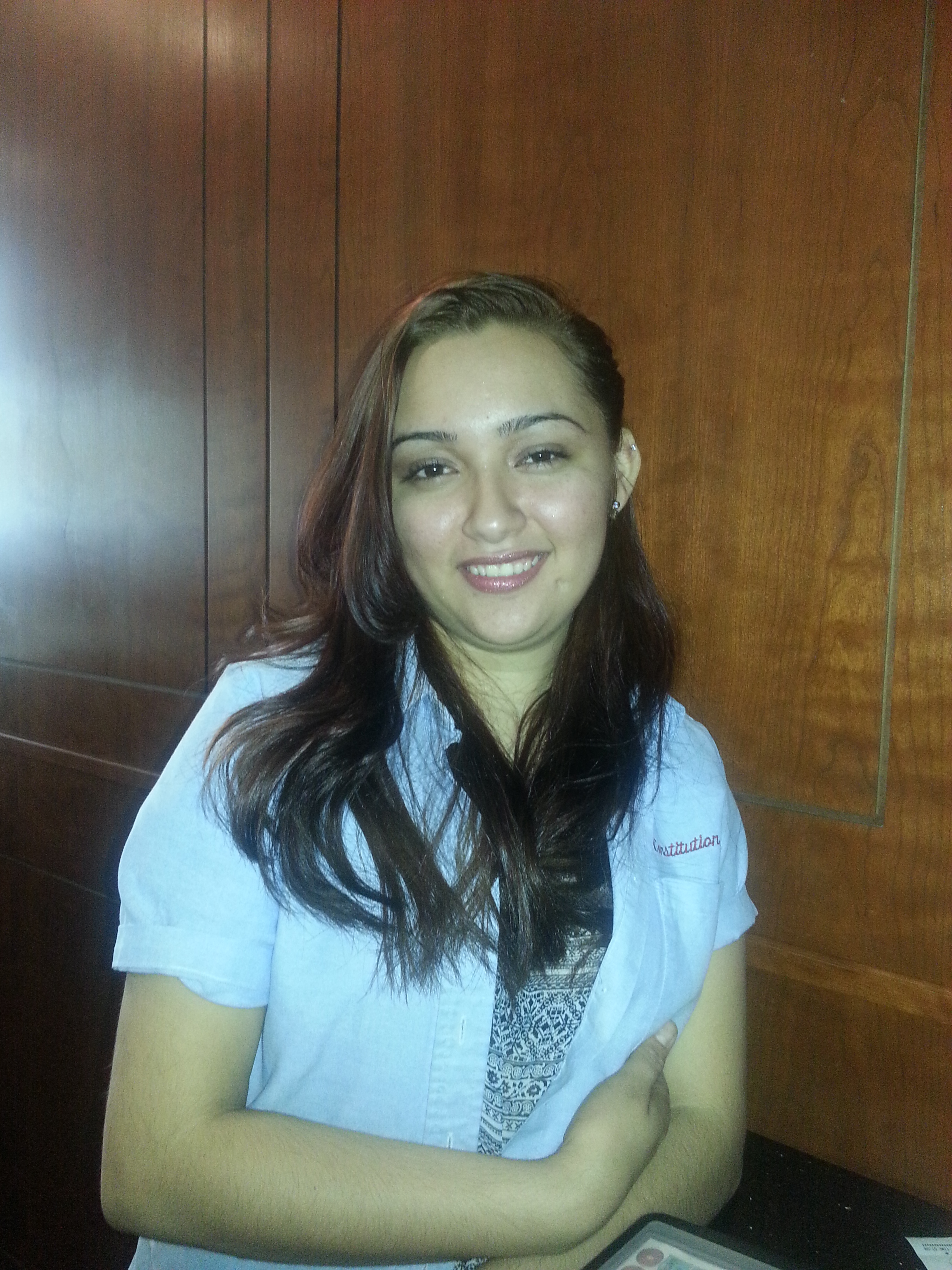
A detail of the picture was bothering me. Her shoulder was sticking out and because the shirt is a little large on her, she had a Quasimodo look to her. This girl is way too cute for that! Luckily I had more than one photo of her. Remember, reference material is important! I used to believe that “real” artists didn’t need any of that crap, that it was like cheating. So the lesson here is don’t be a dumbass like I was!

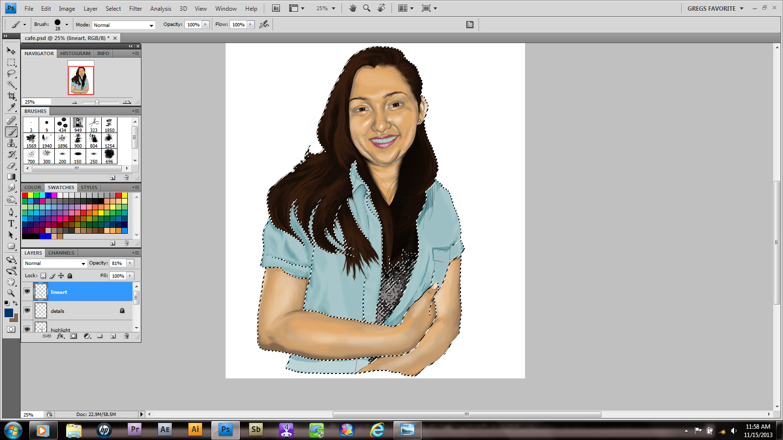
As you can see, by redrawing the area she looks a little more balanced. What you’re creating involves a process and sometimes it will evolve in ways you didn’t expect. Be open to correcting flaws and reverse and flip your image sometimes. It’ll help you correct issues and notice errors. Like leaving out the linework for her blouse! Oops!

Luckily I have a quick fix for that. After opening a new project, you can go file>place and set the image the lines are in on its own layer. From here choose your selection tool and using your shift key, slowly click on the design and transfer it into a selection. When you have as much as you want, create another layer over the image. If it won’t let you, don’t forget to right-click the image layer and rasterize it. Once you have a new layer select it and , using a brush color and size of your choosing, fill in the selection. Copy or Ctrl+C the layer.

this is the layer that will be copied and pasted in the other project

Now return to the original project. After creating another layer under the linework, paste or Ctrl+V the selection onto this layer. I used the move tool to align it, as well as a second layer to cover the area under her arm. I merged them by right-clicking the layer and selecting merge layers FOR THOSE TWO ONLY. I decided to leave the line levels darker than the surrounding line work. Lowering the opacity would have matched it perfectly, but I want the clothing to have a different texture from the person. So I merged it with the linework and locked that layer.

Today I turned on my brain and decided to make a screen capture of what I’m doing. That way you can see the layers and whatnot that I use. For example, here I’m cleaning up my lines and making sure my artwork is consistent with the image. its not easy, but these little touches are what help make this piece. It’s always a good idea to do cleanup.
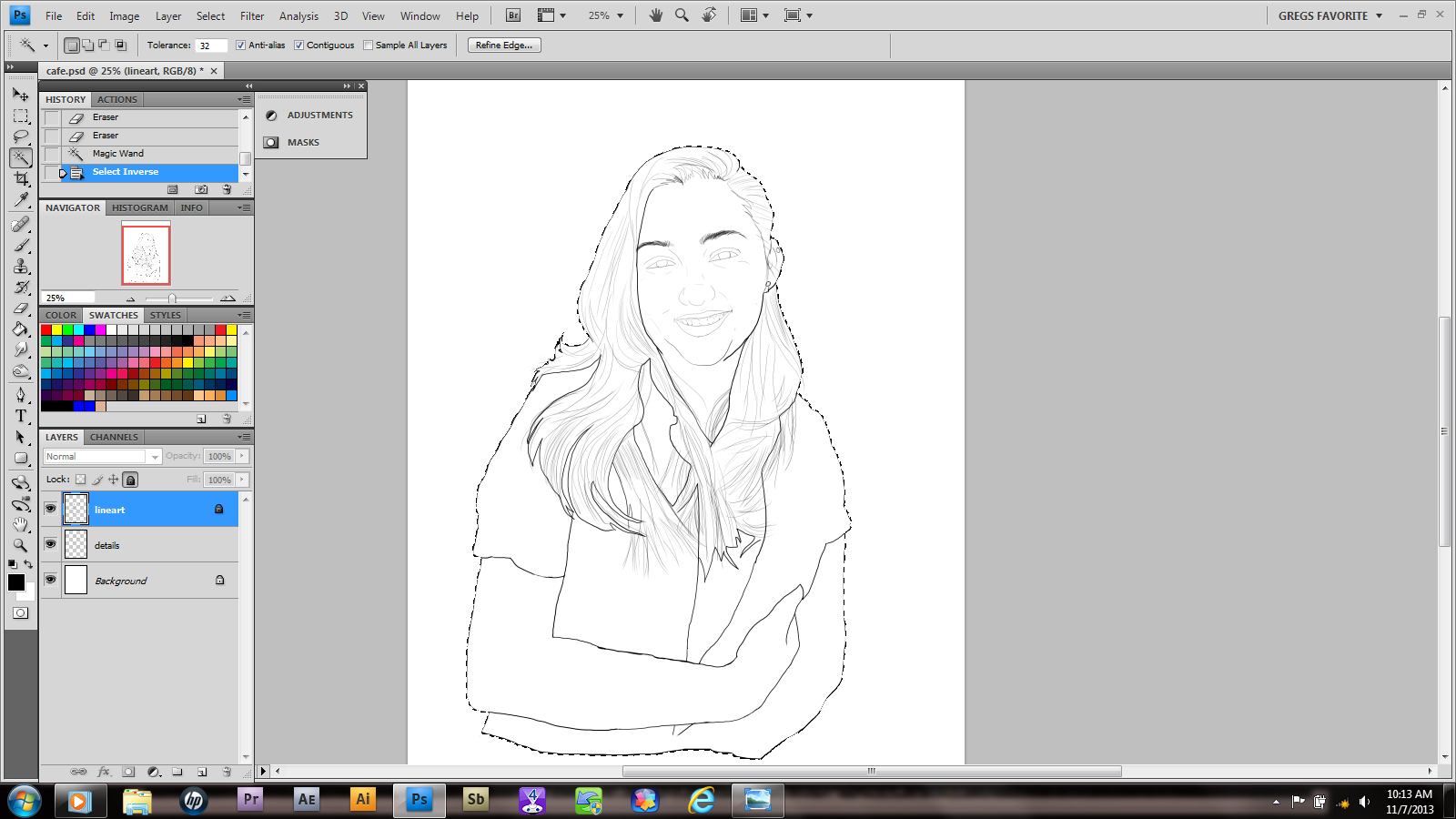
Using your selection tool, highlight your canvas. Since I’m on a PC, ctrl/shift/I inverts the tool so that it selects only the artwork. Also I make sure to use my outline layer for this. Its locked so that any mistakes I make won’t affect it. (accidents do happen!)

Under my line layers I create another layer and label it “dark”. My selections are still up; however only the highlighted layer will receive the affect of any action I take next. I select my dark layer and, using the paintbucket tool, I add a layer of color. notice that since I put it on a layer below the line work, I can still see my art on top of the color.
Here it gets a little interesting. After making another layer above dark, I use the lasso tool to pick all of my midtone areas. These aren’t world class accurate, but I get them as close as possible. From here its a simple matter of filling the selections with a color chosen with the paintbrush tool. Afterward don’t forget to deselect your area by simply pressing the D key on your keyboard.
This will be the subject for my first Muse of the Month pic! I’ve already come up with a theme for it, so hopefully you guys will follow along.

The first thing I had to do was create a layout for her image. I’ve always been partial to poster sized renderings, and since she is going to receive a digital copy of this image, i’m sure she may want to recreate it someday.
Playing around, creating new images with Illustrator. A lot of time has passed and I’m looking forward to getting really busy soon.
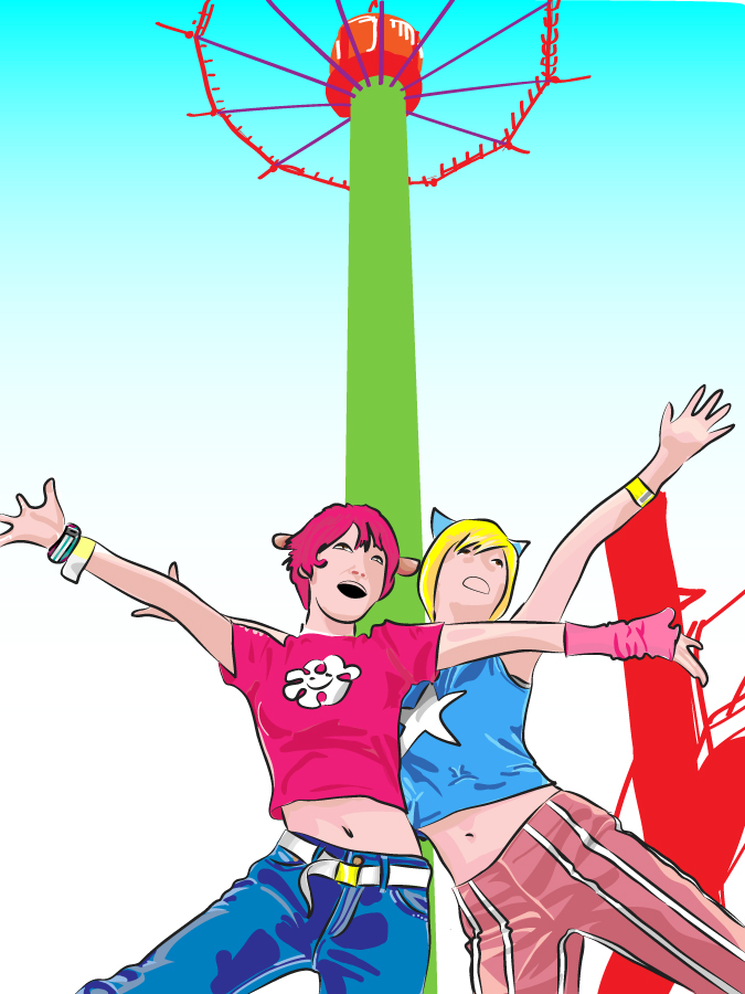
This one is kinda racy, but it looks nice, as long as you don’t look too close!
